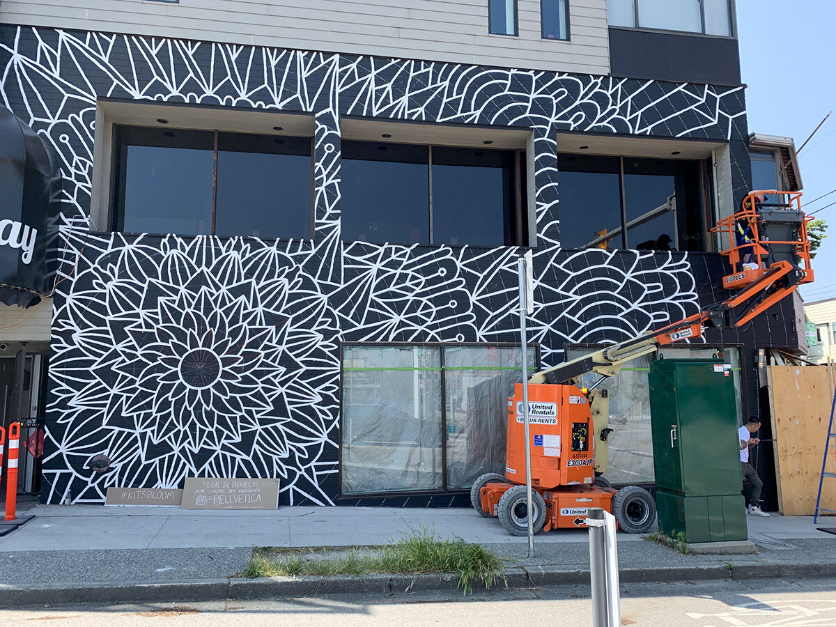
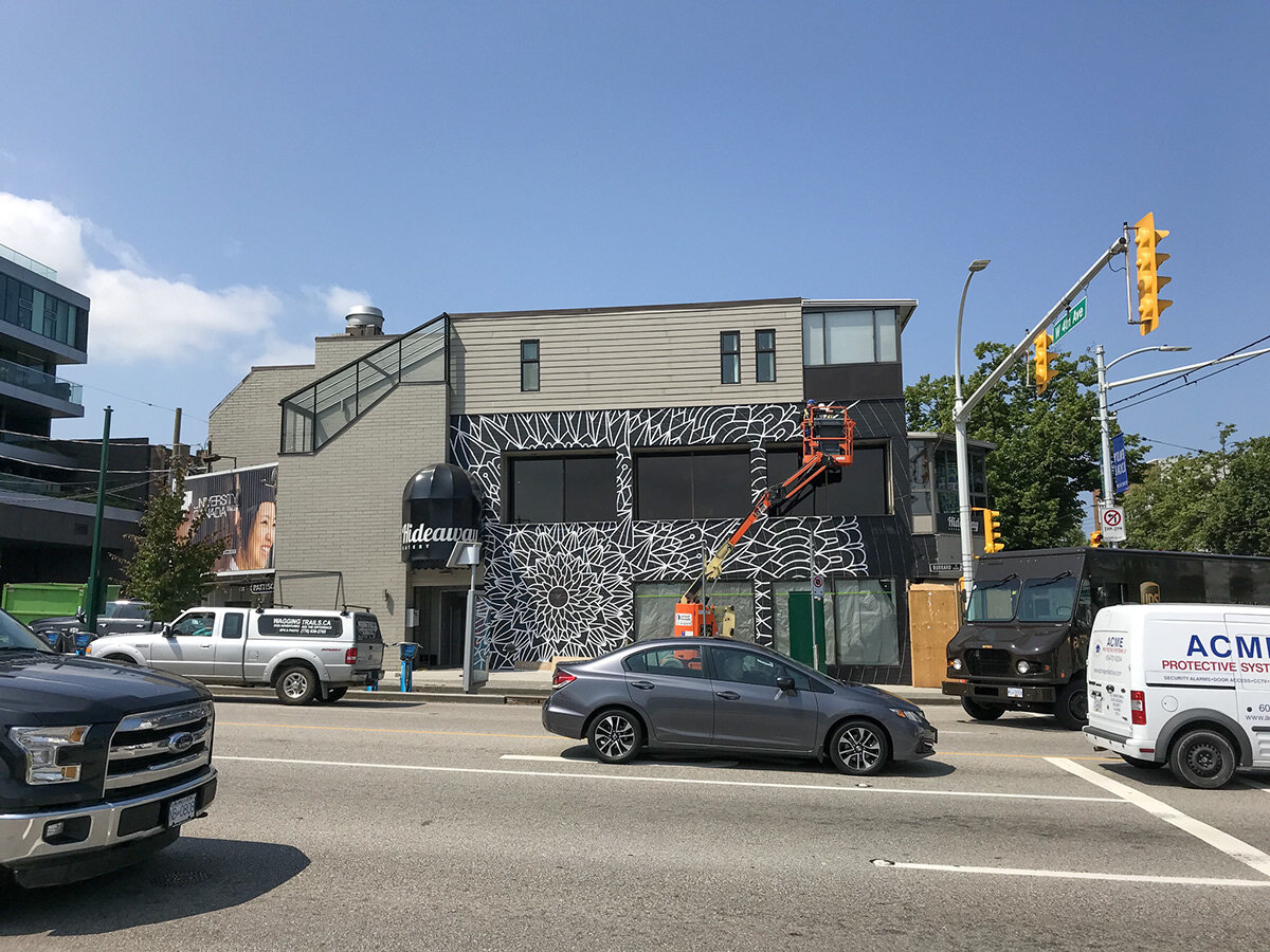
Kits Bloom Mural
It was a cold, late December night, when the ominous iPhone notification sound echos throughout our studio. What was it? A direct message from Instagram–an inquiry that would change the course of history!
Ok, well maybe a bit of an exaggeration, but it did contain the seeds of an idea. That idea was to paint a large mural on the side of a new tattoo shop that was opening up across the street from other of our murals in the neighbourhood– #kitswings. The new mural would not be designed to take away from #kitswings, but rather, be designed to compliment it.
We immediately thought this was a cool idea, and pursued it. It also helped that no other than Ricky Fung, the Founder and CEO of Chronic Ink Tattoos was the one who reached out. Ricky is an incredibly humble and inspiring person, so we wanted to take on this project partially to attempt to live up to his standards. He has a talent for bringing together a great team of people and the artwork they produce speaks for itself. How could we pass up an opportunity to work with Chronic Ink? The answer was, we couldn’t.
The Process
Making art is not an intuitive thing for us. It is a process of trial and error as well as learned technical abilities. We spend the vast majority of our time planning the "how's" behind the "why's". As an example, how do you install a large mural over a building on a very busy street? This planning process is very stressful, but also very rewarding when your ideas work.
Our first major challenge of the project was the timing and bureaucracy of installing an outdoor, publicly accessible mural in a city. It is not as simple as painting whatever wall you want.You need the approval of a few levels of local government and the permission of the building owner, and you need a budget for many aspects of the project, like permits.
We agreed a late May install time was the best time because it allowed Chronic Ink to obtain their permits, and pass their building inspections, and it allowed us to paint with statistically good weather. It rains a lot in Vancouver during certain months, but the city typically has good summers with little rain. This timing aligned well because Chronic Ink could open up just after we completed the mural as part of the launch plan.
Completing a mural before opening day presented the first obstacle to be overcome. To overcome it, it means you need a sufficient amount of time leading up to the opening date. The challenge, however, was unpredictable weather and the amount of time we would need to complete the work. We were also flying 3,500km from where we live in Kitchener, Ontario, Canada to complete the work. Needless to say, a lot of pre-planning needed to occur.
With the templates in hand, we start sketching. A combination of conversation and sketching finally leads to an idea that we are both satisfied with, and that we think is strong enough to pitch to Ricky. These sketches help the client understand in a visual way what our ideas are, and what technical challenges we foresee with the design. It is also the period of time where the client has a serious impact on the design direction.
Instagrammable Social Media Integration
When designing this work, it was important for us to integrate a social media element into the art. With all of our works, we always find creative ways to engage with the public and drive community conversation. Given that this work was located directly across the street from #kitswings, another highly engaging, interactive and social media savvy mural, we wanted to create a partner piece which would further engage the public.
We recommended a central position of the mandala (Position 1) on the large square shape so that it could become a "selfie" background, but we also explored alternative mandala placements below. The client agreed on Position 1, and we moved forward.
After a lot of thought, sketching, experimentations, and iterations, we land on a design we are all happy with, at which point we significantly polish the design and tighten it up. By designing in an iterative manner, and having the client provide feedback as often as possible allows us to lock the design down with confidence. It is the locking down period that we spend a lot of time intensely paying attention to the details.
Doubling the Scope
Another major adjustment took place during the design exploration process. Initially, we had set up to paint only half of the height of the wall, or up to the middle between the top and bottom windows. After seeing the mandala come together though, in situation, the client asked us to explore conceptualizing to extend the mural up the entire height of the wall. This added a number of new technical challenges since we had originally planned to use ladders to complete the work.
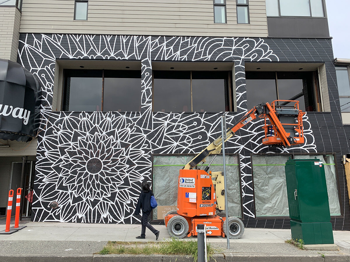
The new design required the addition of a boom lift rental, as well as determining how we were going to paint double the line work in the same amount of time. We also had to review additional permits to ensure our boom lift did not block the sidewalk from pedestrian traffic. It was a challenge we were up for because we agreed, the wall looked MUCH stronger with the addition of the mandala extending to the second level of the building.
Now, time to book flights, figure out where to stay, where to buy materials, and a million other things. Luckily, the City of Vancouver has strong support for street art and helps by priming the wall black for us, by paying for our material expenses such as paint, tape etc. and most importantly, spraying the artwork with anti-graffiti spray at the end. This forward thinking about street art is something we will advocate for all cities to adopt.
The doubt and anxiety sets in…
We have a minute to breathe, step back, and think about what we’ve done so far… Holy crap, what have we done? What are we thinking? What if this happens? What if that happens? What if people don’t like it? What if I can’t do it physically? What if what if what if? Step back… breathe… relax… take it one day at a time. Deal with stuff as it comes up, and don’t fret over it now. Keep your mind focused on the prize, which is the opportunity to create a very cool piece!
The day has arrived. You are packed, and ready to go. You’ve thought of everything, or so you hope. Time for the airport, fortunately the weather forecast looks perfect! Now that takes a huge weight off of our shoulders.
Headed west to Vancouver
We land on a Sunday and have until Friday to complete this piece. The weather is looking good, and now we can focus on collecting the appropriate materials. The City of Vancouver generously pays for our materials, so we are as diligent as possible to spend tax payers money as wisely as possible. Only buy stuff we absolutely need.
We needed to pick up materials from various locations across Vancouver, and being a beautiful Sunday, we decided to walk most of the time. This was a good way to unwind, take in the sights, smells, and sounds of the city, and get psyched about the job ahead.
Arriving to the Site
We arrive on site with all of our materials and find that the site is loaded with contractors since Chronic Ink only had a few days left to complete the few remaining tasks they had left. This was a great thing for us, however, because this meant we had access to ladders, and to tools the contractors leant us from time to time (thanks again for the laser level!).
Grid System
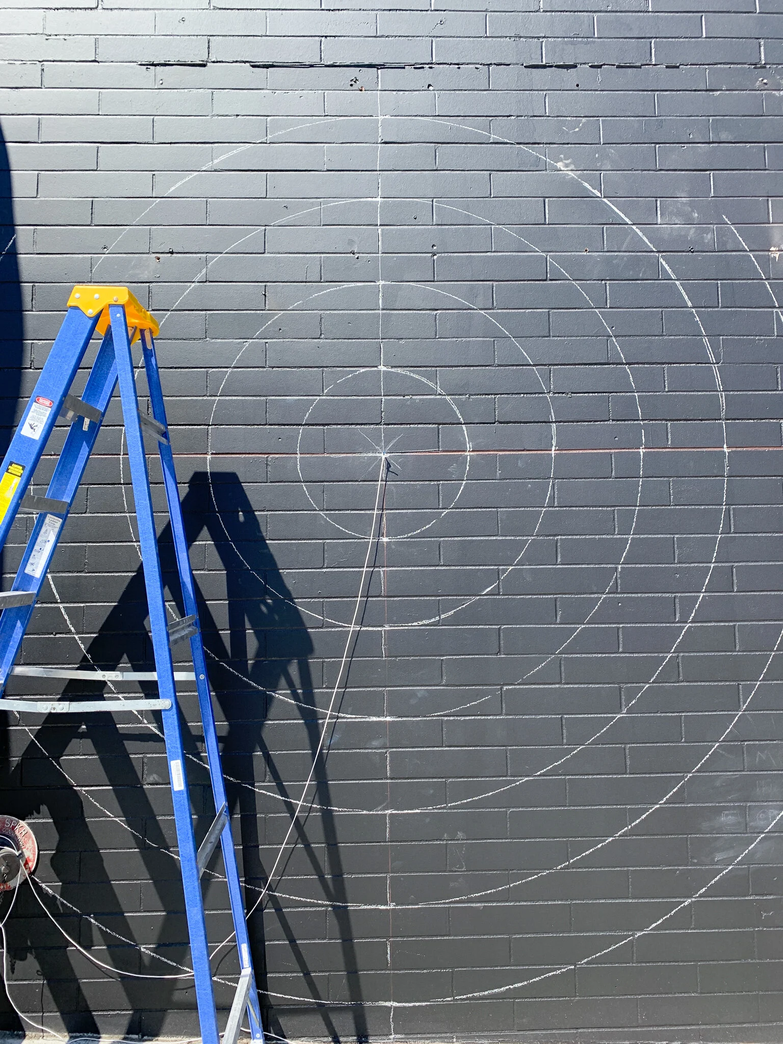
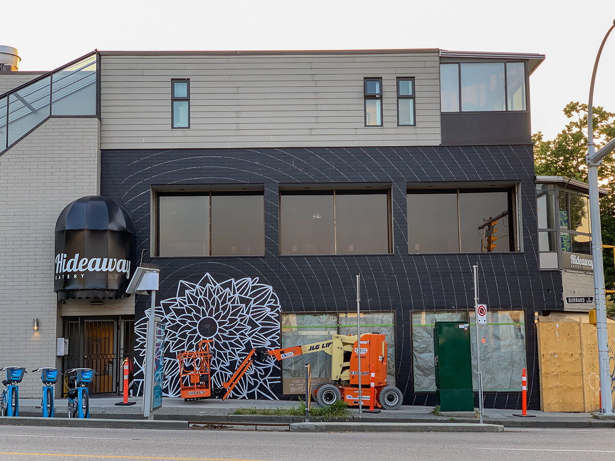
Day one was spent primarily planning how to install the underlying grid system which helps inform the rhythm of the entire piece. This grid system was subdivided into 12” radial circles which emanate from the center.
Transposing
The grids primary function in this case was to allow us to manually transpose the artwork on to the wall. What we mean by manually transpose is that most murals are traced onto a wall using a method of projection. Projection allows you to save a huge volume of time, and maintain a tight accuracy over such large spaces. However, there are many situations where you can’t use a projector. In our case, the projector would needed to have lived on a busy street, which for obvious reasons is not a good idea. We have no choice but to draw the artwork on the wall by hand. This is major challenge two. How to draw this on the wall?
String & Chalk
Having premeasured the space in advance, we were able to design the piece so when manually transposing, we could use mathematics to our advantage. For example, each ring of the design is exactly 12” apart (the same height of 3 of the wall bricks).
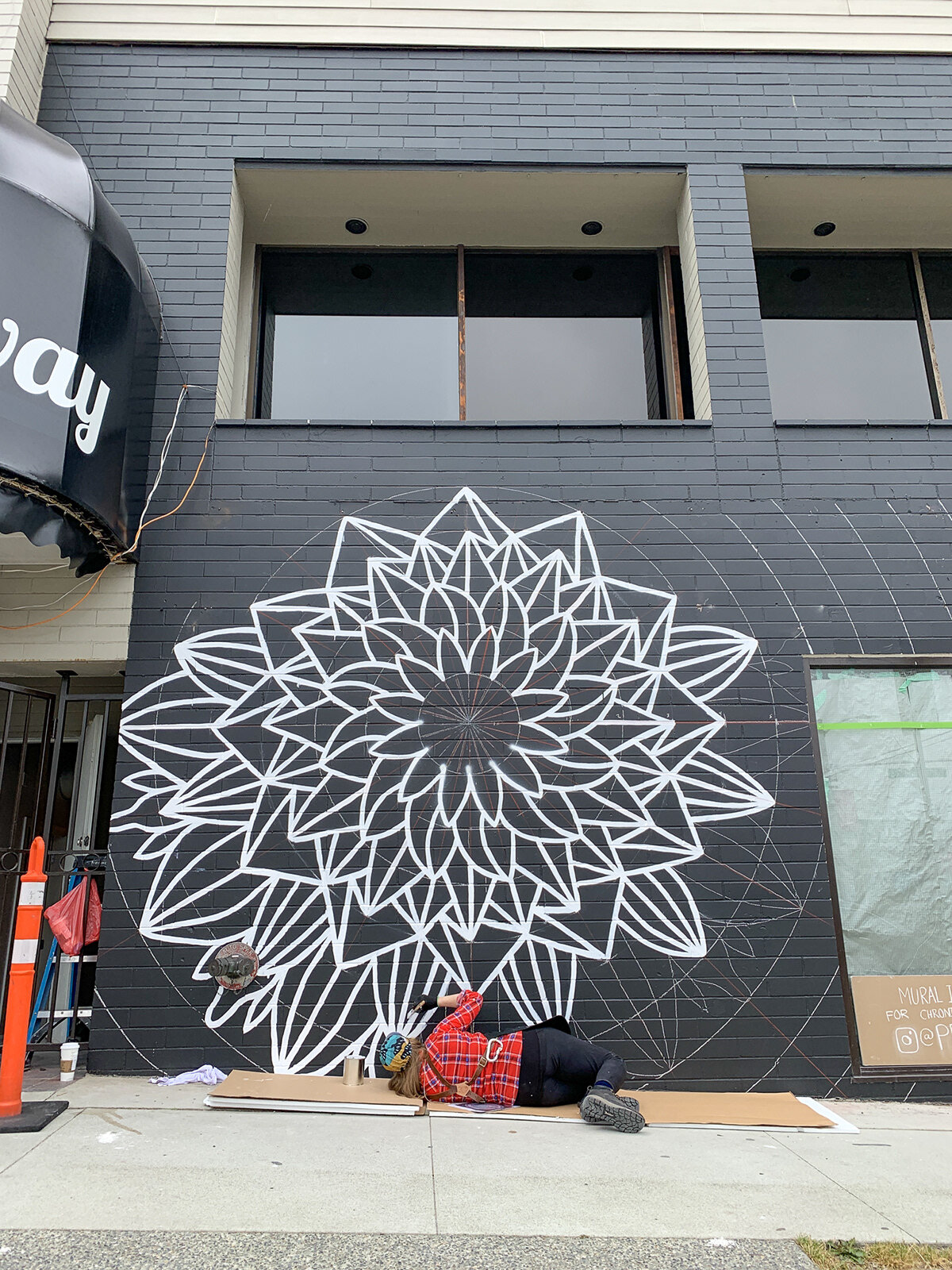
So the first step on day one is to create large circles, 12” apart using string and chalk fixed to an anchor screw at the center. Once complete, creating lines every 15 degrees with a chalk reel. This sounds easy, but it was very time consuming and cumbersome due to the windows of the building. Building this underlaying grid however is the best way we can use as a guide which adds a neat and tidy rhythm in the piece.
Time to Paint
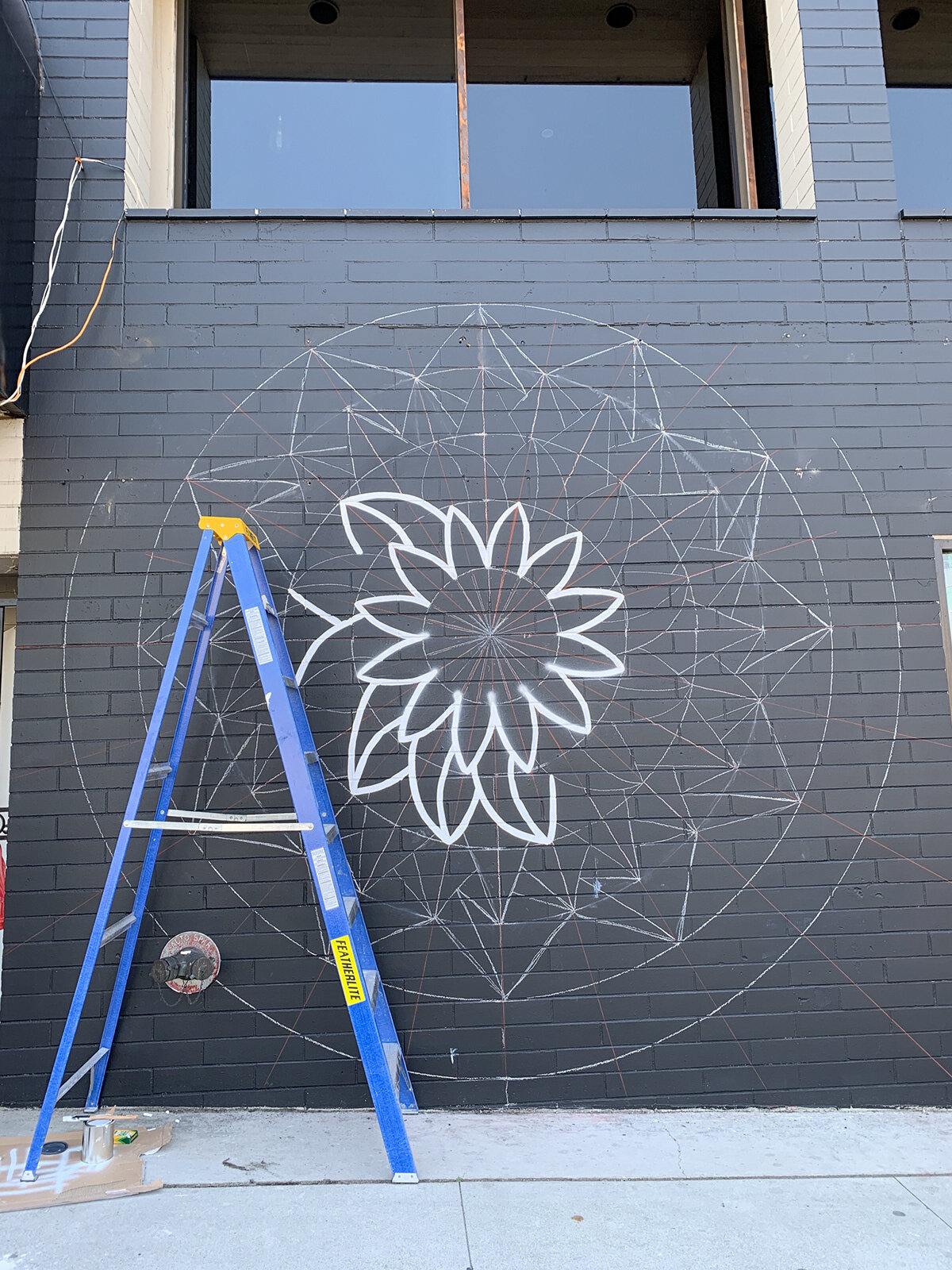
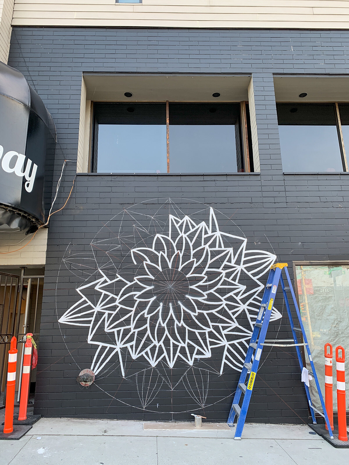
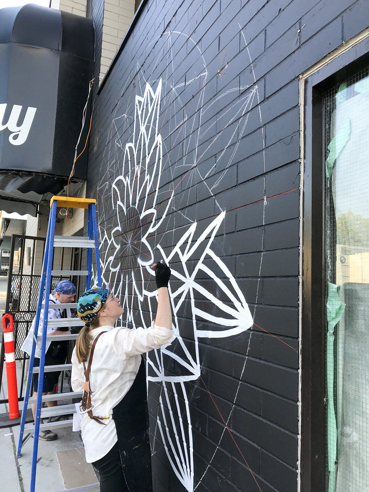
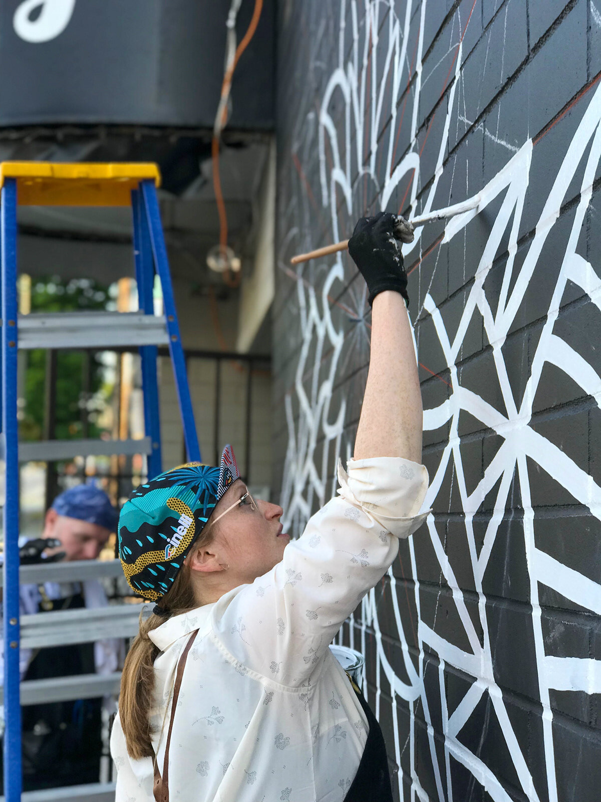
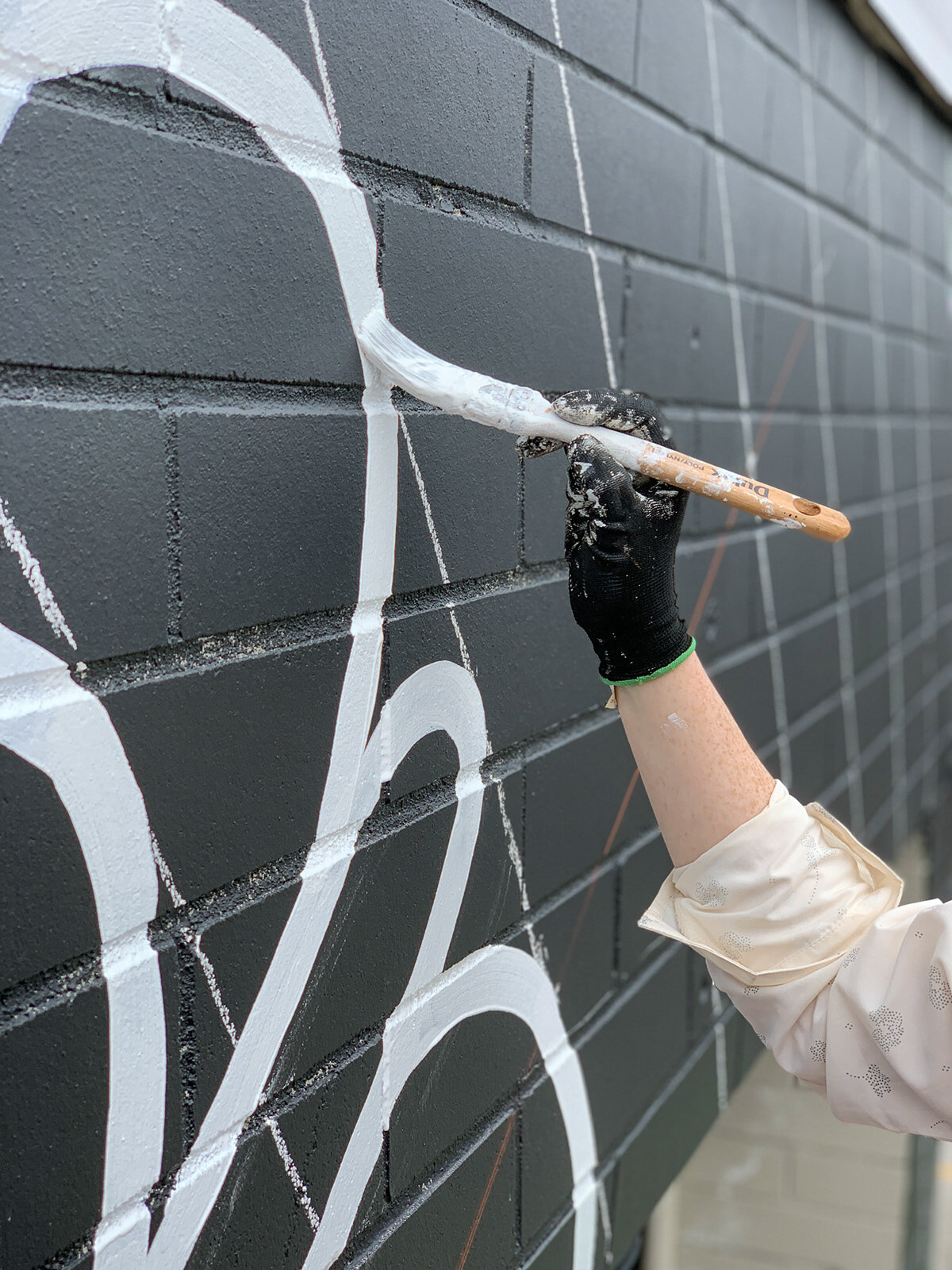
Now that the grid is complete, we can focus on drawing the artwork on using chalk, and follow along with paint. Having pre-planned everything in advance allows us to simply follow the guide we created for ourselves. If our measurements are off by even a fraction, it becomes very noticable the further away from the center it gets. We are fine with a certain level of imperfection because we see wabi-sabi in that.
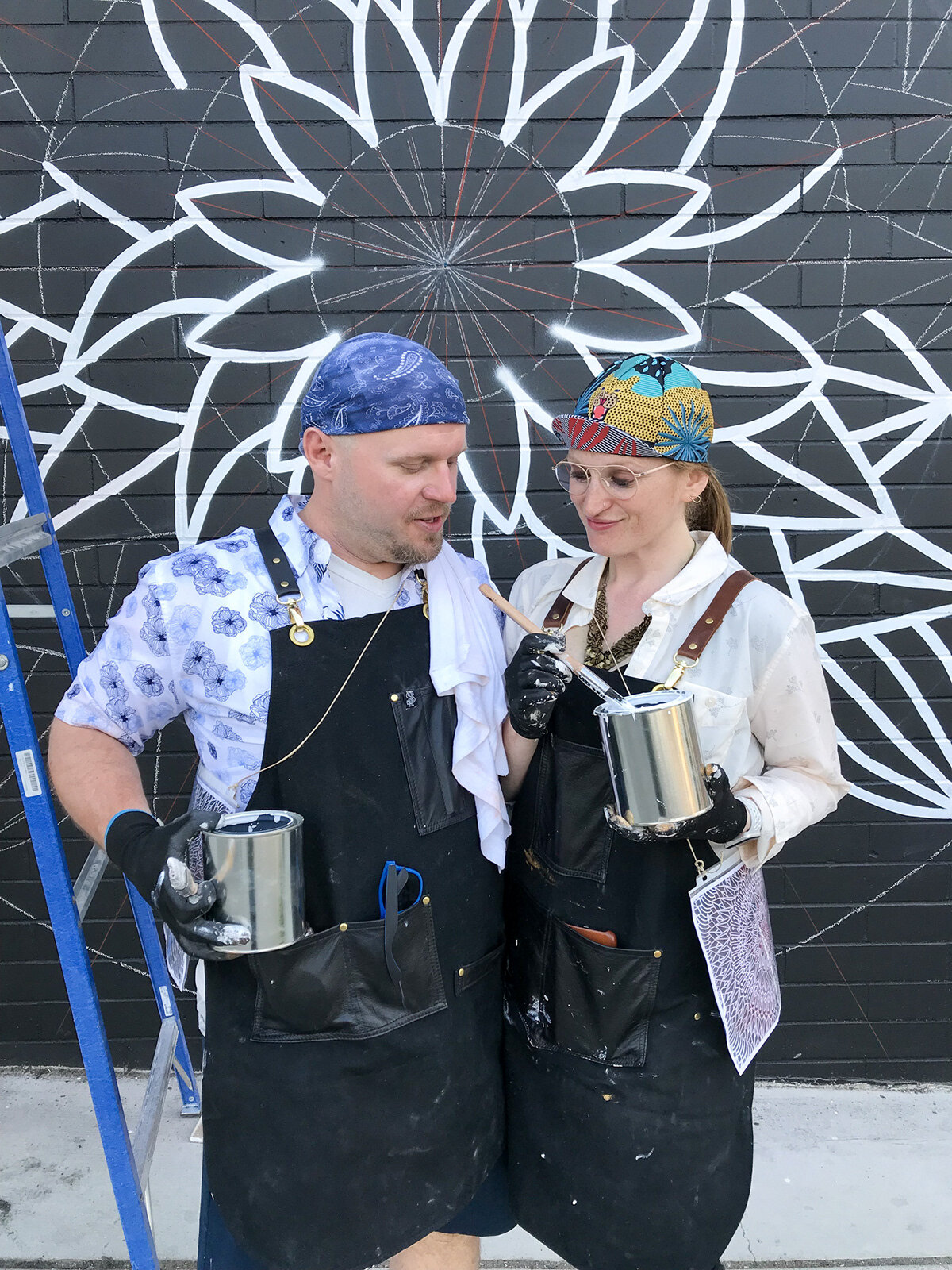
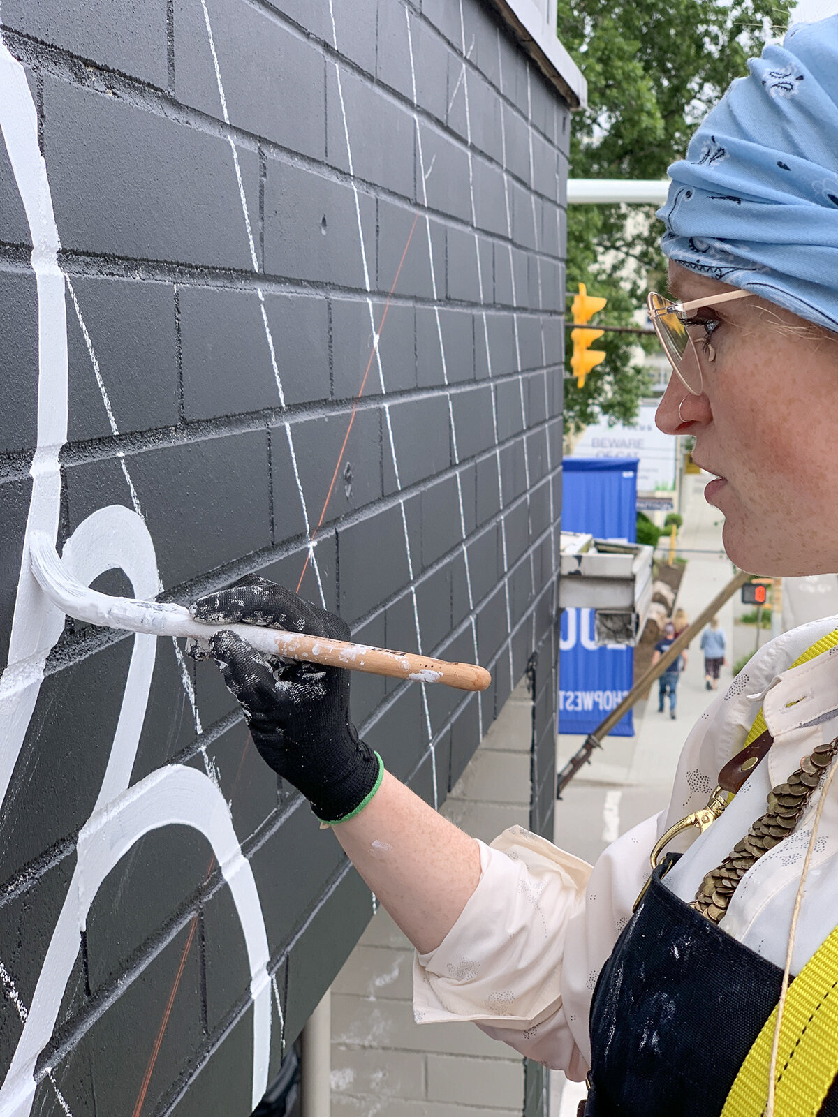
Now enters major challenge three. We bought enough spray paint and needle caps to complete this piece efficiently. Bricks are a bit time consuming to paint on with a brush, so spray paint is a quick and effective way to cover large volumes of space quickly. The only problem is, it looks brutal in this case! The feathered edges are just ugly, and would be way too time consuming to clean up. So we opted to paint this piece using a brush. The benefit to the brush is we can paint very clean, consistent lines. It just takes a lot longer.
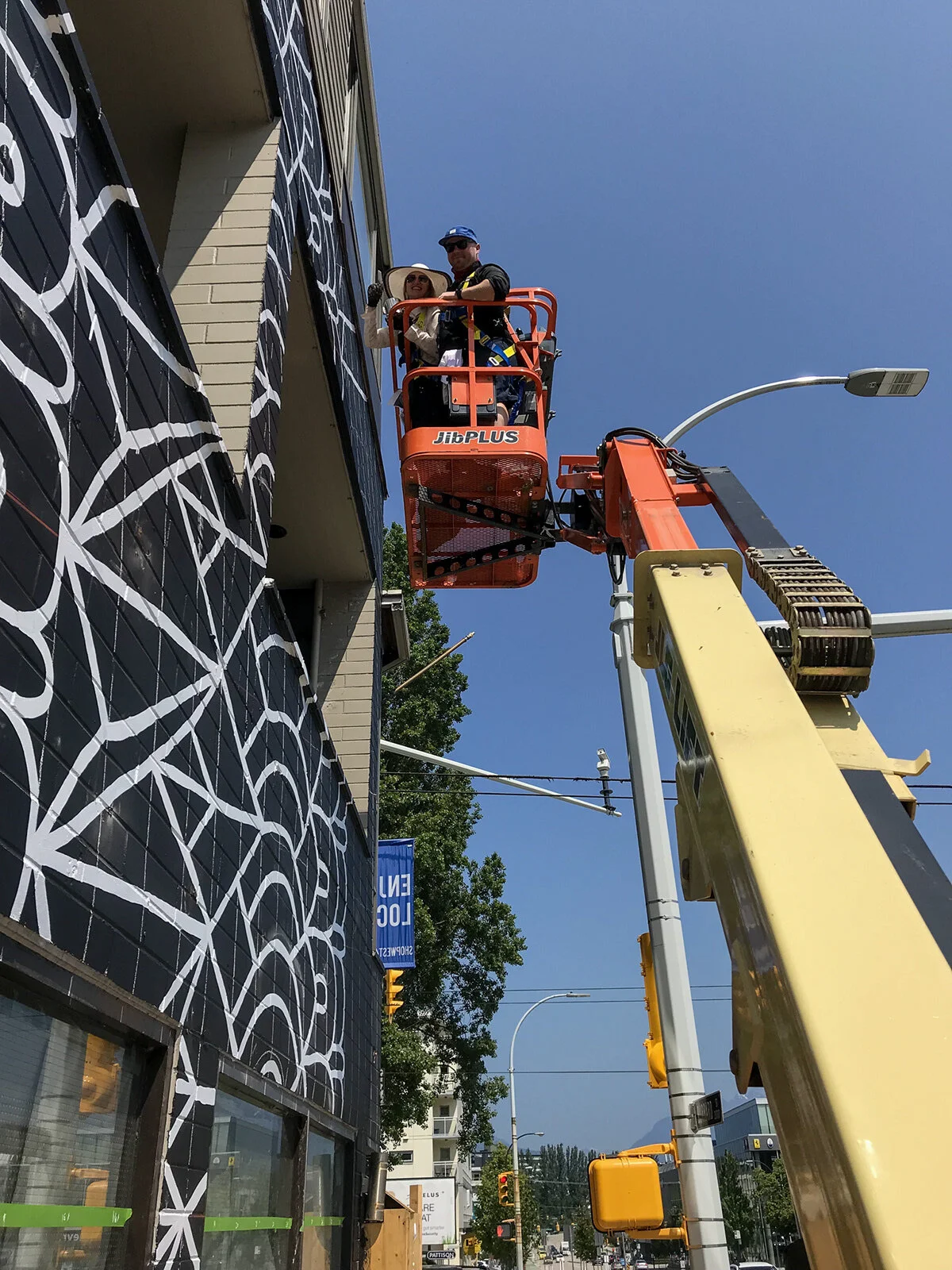
Painting at such a vast scale needs appropriate heavy equipment to get the job done. In our case, we used a United Rentals Z-30 Electric to help get us to the hard to reach places, which happens to be the majority of it. We put on our safety harnesses and got to work.
The Turning Point
After a while, we really started to love how the simple black and white looked together. We originally planned the piece to have gold as well, but seeing how it was weathering on the nearby #kitswings piece made us a bit apprehensive about adding gold to a black wall. The problem here is the client approved the design with gold, and we already purchased all of the materials. So the first thing we needed to do is have a serious and compelling reason why we want to eliminate the gold. We call Ricky and make our case. Fortunately, he agrees with us, and we eliminate the gold. This saves us a lot of time and gives us a bit of much needed breathing room.
Painting murals at this scale is a physically demanding activity. To meet our deadline, we need to put in long days to complete it. We love the challenge, but it definitely takes it’s toll on your energy. But now not needing to paint the gold means we can spend more time focusing on the black and white line quality. The most poignant thing for us was all of the people who stopped by in support of the project, and all of the people who helped make the project happen. The support is definitely a motivating factor which gives you the energy you need to push through.
After 120 hours of intense focus and effort, we make the final strokes and the work is done.
Goal Achieved
Now we’ve finished the work, we pack up, return any unused materials, and head back to the place we are staying in and prepare to head to the airport for home. Job well done! The client liked the work, the neighbourhood likes the work, and we were able to complete our objectives and commitments effectively. We learned a lot throughout the process and lucked out on the weather.
Introducing #kitsbloom...
This mural is designed to inspire a feeling of growth, positivity, and balance. It is something different for everyone, but brings everything together through a shared experience. For us, we see #kitsbloom as a blooming flower, as well as representative of the light bloom from our most local star, the Sun.
Careful consideration went into the development of the shapes that made up this mandala. Each layer builds upon itself to create a work that symbolizes self-healing and love. Look closely as each ring shifts from floral, organic pattern work, and then changes to rigid, geometric shapes that represent the rocks and mountains of the west coast.
Thank You! Oh, and do remember, for your safety, please don't stand in the bike lane if you take a photo in front of it.
We would like to thank all teams who helped to make #kitsbloom happen, including the City of Vancouver, the BIA of Kitsilano, Chronic Ink, Dulux, Opus Art Supplies and others. We couldn’t have done this one without you!


