Galt Wings Mural
Located in the beautiful neighbourhood of Galt, situated on the Grand River in the city of Cambridge, Ontario 🇨🇦
In the summer of 2019, The Art of Home in Cambridge, Ontario, Canada had a vision. They wanted to create an interactive mural which would contribute to the community and attract people to the neighbourhood. Fortunately, they had seen our #KitsWings mural online, and liked the style and engagement that this mural has, especially on Instagram. As a result, they reached out to us to see if we were interested in visiting the site to discuss their idea further and potentially provide a quote for us to create something similar, although totally unique for their space. After meeting them, we knew right away these were people we wanted to work with. They are passionate, incredibly smart, and hyper motivated to see not only their business grow, but to see the neighbourhood they call home thrive. They recognized the benefits of well thought out street art as a tool to get help them achieve their vision. We could not pass this opportunity up, agreed on a budget, and began the process of conceptualization.
Downtown Cambridge, Galt, on the Grand River in the Region of Waterloo, Canada
The Process
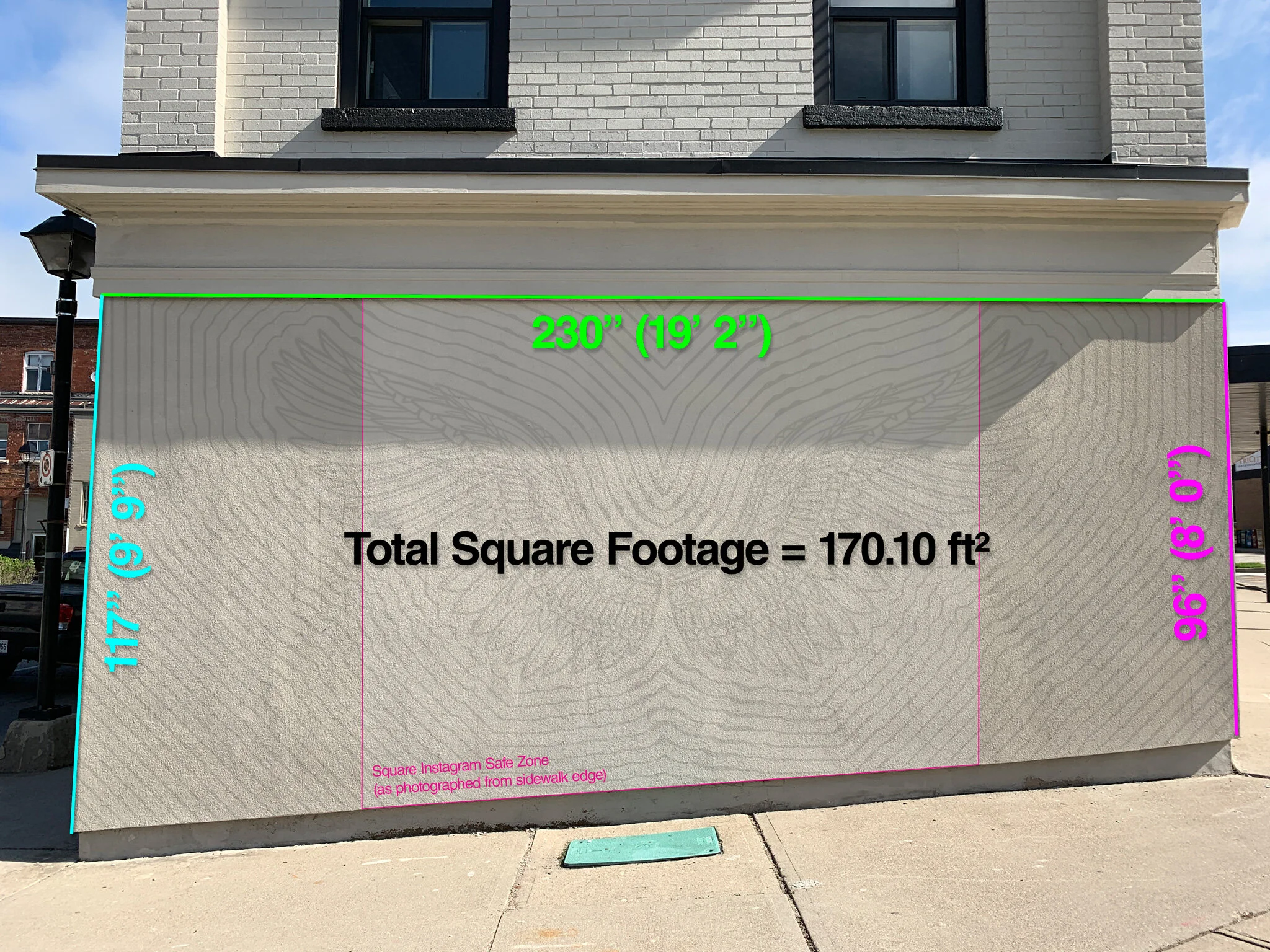
We start by visiting the site. Photos never do a site justice simply because you can't really perceive how large the wall is. It is easier to get a sense of scale, space, and proportion when looking at the wall in person. This also gives us the time to take accurate measurements which we rely on for conceptualizing our ideas.
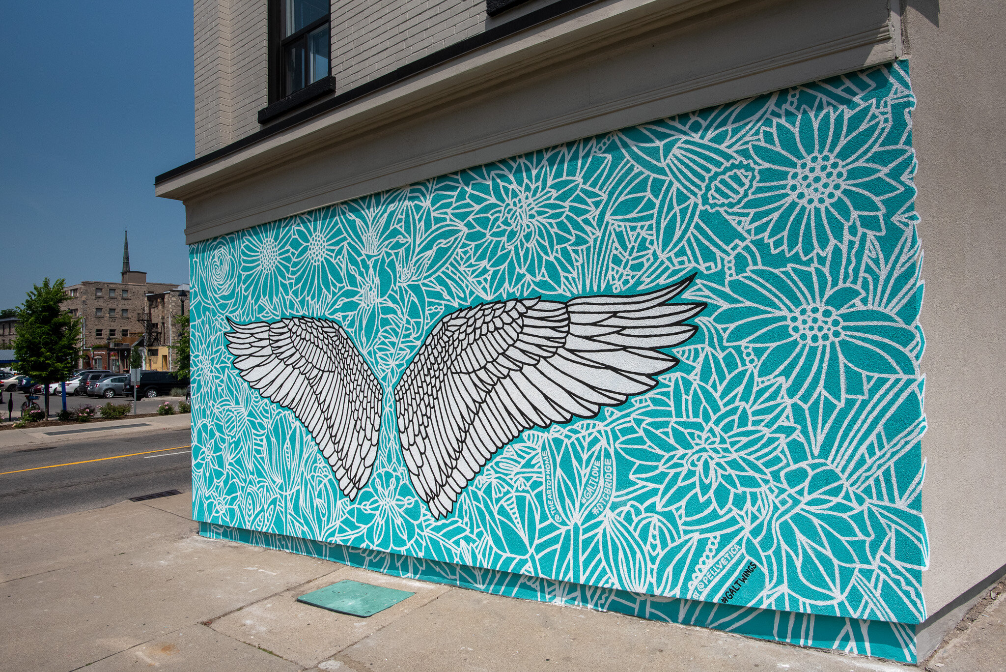
The asymmetry of the wall in these photos is because it is situated on a small incline. We take this technical challenge in to consideration when conceptualizing how the proportions of the space can play a role in the artwork itself. In this case, we will design something with in a rectangle and simply crop off the areas of the artwork that the small incline covers.
First major challenge: Painting over stucco
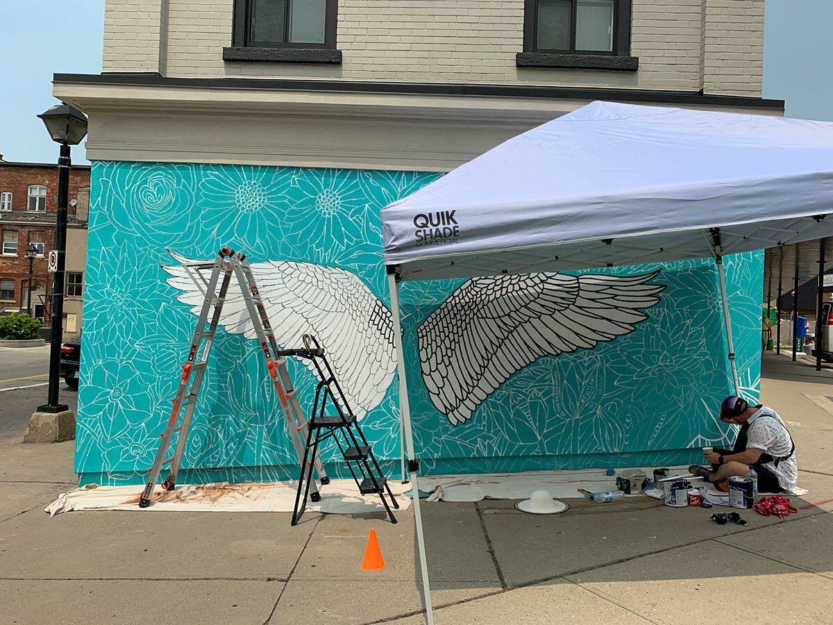
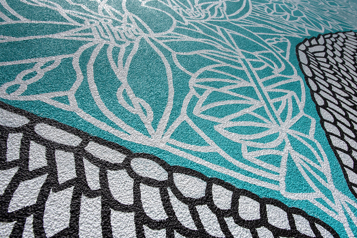
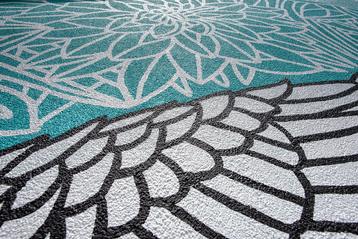
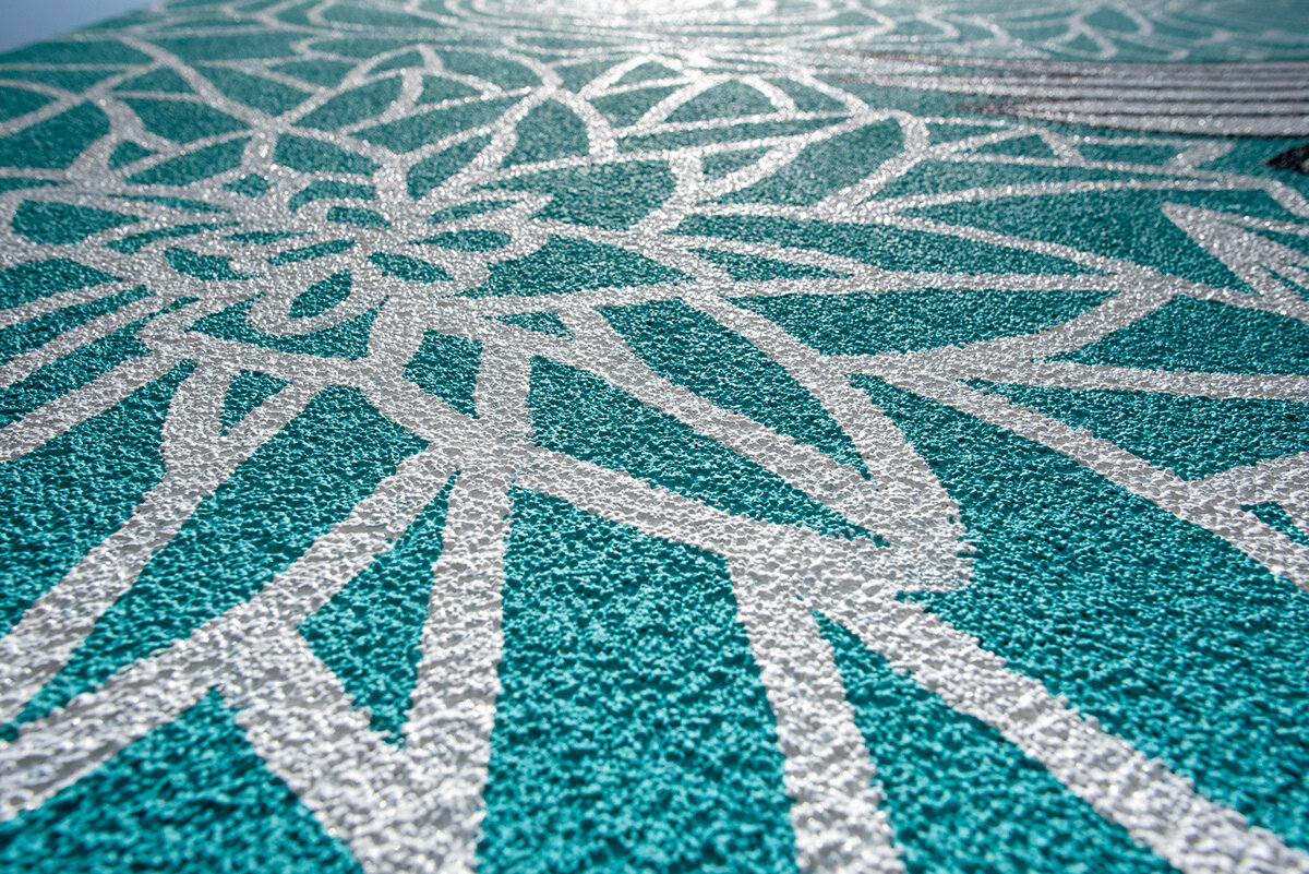
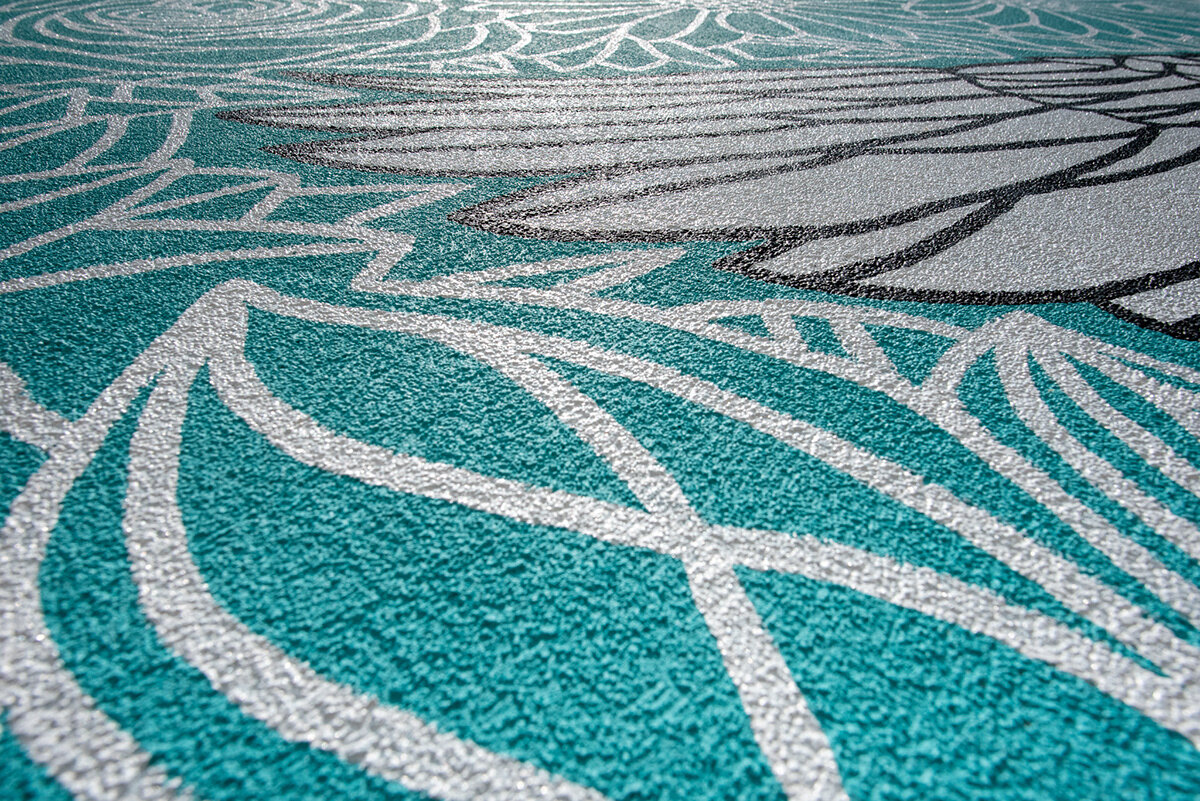
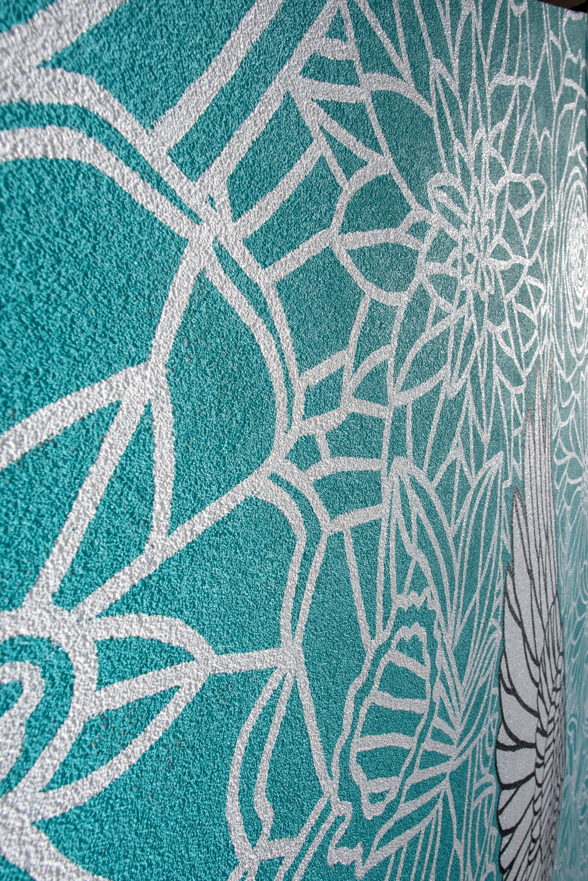
On site, we notice a major challenge right away. The wall is not smooth at all, it contains deep ridges of stucco, or plaster, or whatever it is. Regardless, it will require a much larger volume of paint compared to a flat wall, and rolling it will prove difficult, so we begin to consider the technical challenges involved with painting such a space. In all honesty, this characteristic of the wall nearly drove us to cancel the project, but we always say we like a good challenge, and what better challenge than using 3x more paint and time to create a mural 😎. (Yes, that was subtle sarcasm). We would not let this challenge stop us from trying.
Conceptualizing Ideas
Below you can see our first thumbnail sketch which is so hilariously sketchy and bad, it is almost embarrassing to share, however, our ideas often live exclusively in our minds, so even a quick sketch such as this one helps us visualize what we are thinking to see we are on the same page. Quick sketching, or thumbnail sketching, is a language in itself that perhaps we can only understand, but the seeds of the idea start to form. As the saying goes, a picture is worth a thousand words.
As we iterate through the process, and sketch more ideas, further refinement begins to happen, and we start to try a variety of ideas such as dragonfly wings, or Canada goose wings, and more. Some of our early ideas included the thought of a popular phrase in the area "#GaltLove" done typographically, or a black background, but we later abandoned in favour of simplicity and a teal background which better suits the client's brand. The client provided excellent feedback on what they wanted, and gave us a lot of creative room to interpret their vision. This room to explore is something we greatly appreciate, and hunt for in projects.
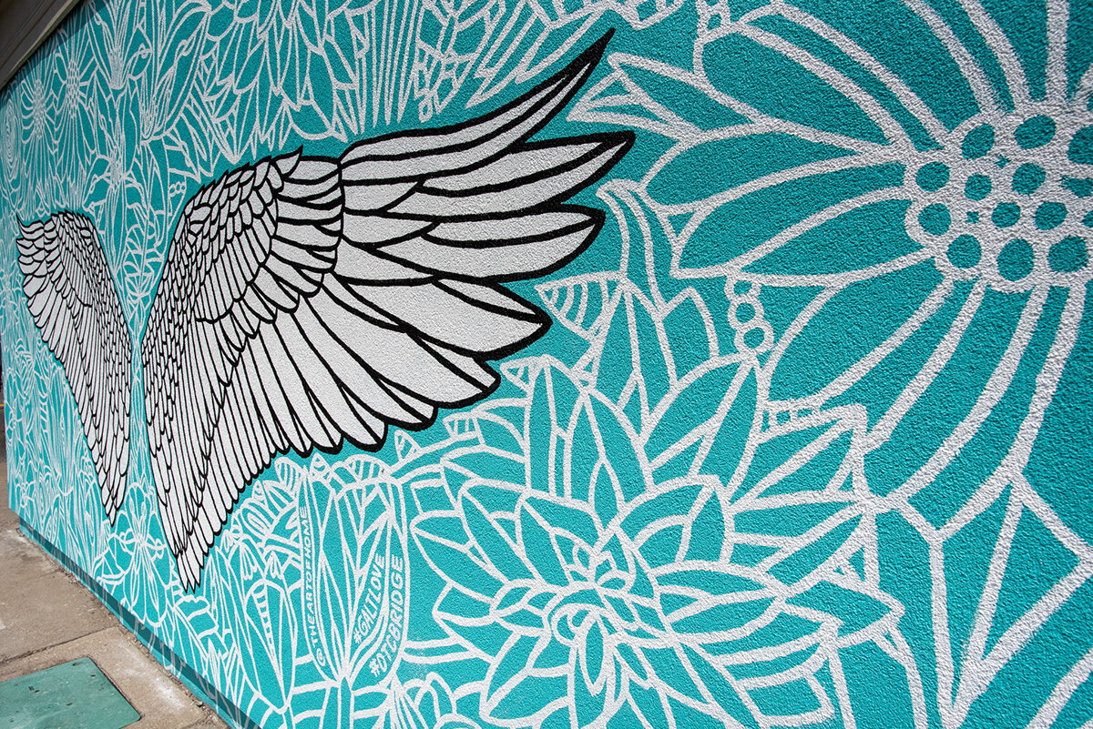
Through conversation, iteration, and conceptualization, we land on the idea of a large pair of interactive Canada goose wings which people can take a selfie in front of. Although we love abstraction, we study literal aspects of a Canada goose wing that we're interested in capturing, such as placement of feathers and how many feathers in each section of the wing. The illustration below shows how we start to subdivide the wing in an attempt to find some literal accuracy, all while maintaining our goal for abstraction. This doesn't look like a goose wing, but it is, and that's awesome!
After many iterations, the final illustration starts to come together. We are excited about the iconic Canada goose, since it is a very common sight along the Grand River which so beautifully flows through Cambridge.
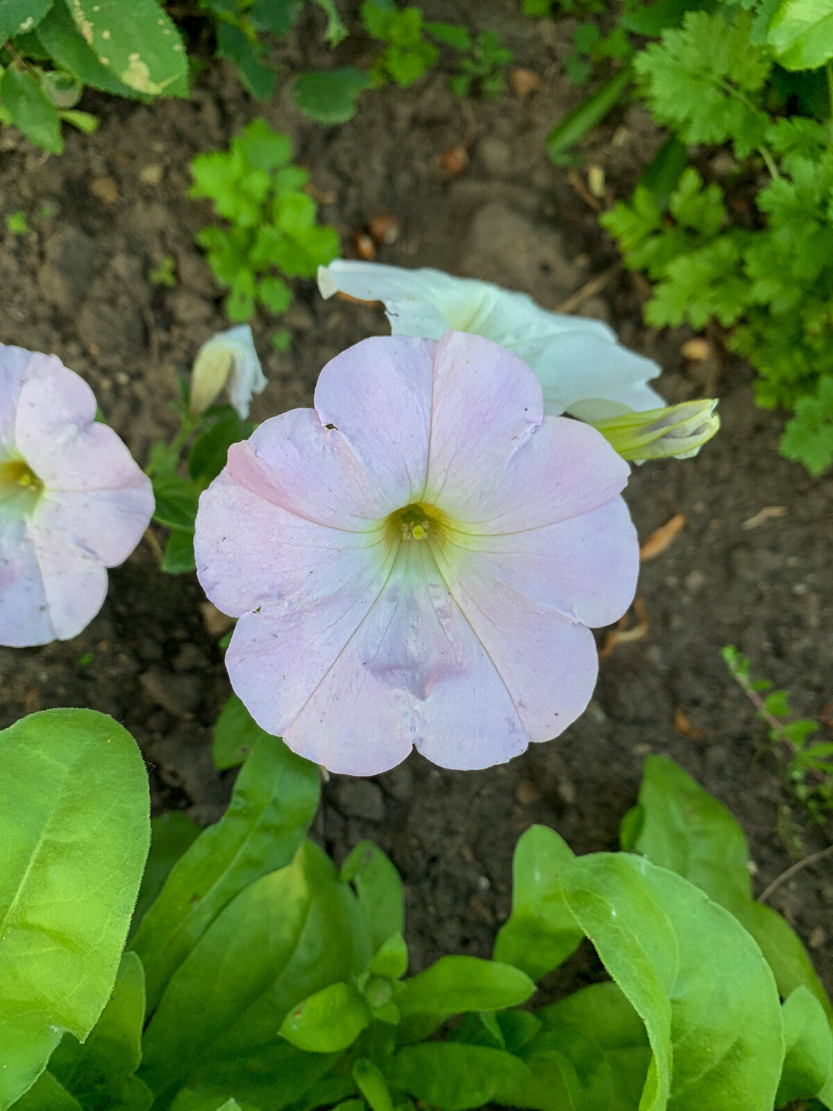
Now that we are pleased with the direction and the way the wings could look, we spend a lot of time looking at and photographing the local flora of the region to get inspiration for the background of the wings. Below are some photographs of some such inspiration, all shot with in 1,000 meters of the wall's location.
We took elements of some of our favourite photos, and plants, and combined them together to create the background image seen below. We focus on contrast, and composite a garden of plants that will gracefully compliment and surround the wings.
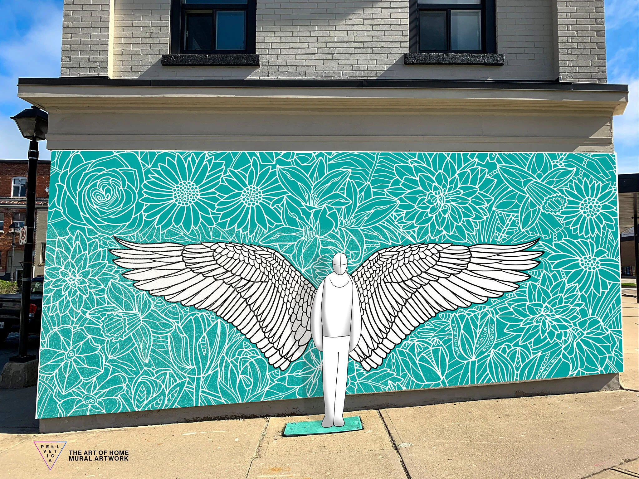
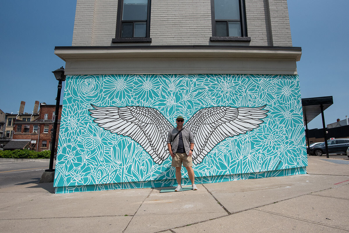
Once we have a solid iteration on how the final art will look, we composite the artwork on photographs of the wall we shot during our site visit to get a general sense of how it could look. Because this piece is destined to be interactive, we also take the height of people into consideration to help determine where the wings should be positioned off of the ground. Although we aren't experts on average human height, we try to aim between 4 and 6 feet (1.22m <-> 1.83m) while considering the ability for slightly older children (5+) to fit in the frame, if they jump (which looks so awesome!). We try to make the composited concept as accurate as possible, and use it as a guide when painting the piece on to the wall.
We spend time conceptualizing how it could look if a person stood in front of the piece, which also helps us determine where they should stand.
Once the final artwork is approved, we then spend a lot of time polishing the design, often in Adobe Illustrator so we can provide the client with a vector version of the artwork which they can use in marketing materials or wherever they please. We don't normally provide vector artwork to clients, but in this case, the client paid for the usage rights to use the artwork freely. At which point, the many technical challenges of physically painting on this stucco wall begins.
Painting production begins
Based on our concept art, the client hired a company to prepare the wall in one of their brand colours, the rich and vibrant Pantone 7472c (teal), which they did an excellent job with. Painting over stucco uses a lot of paint, and they covered the wall almost perfectly making our job easier because of the relatively smooth texture of the paint they used. Thank you Goodbye Graffiti!! They will also coat the artwork with an anti-graffiti spray in the end. We love them!
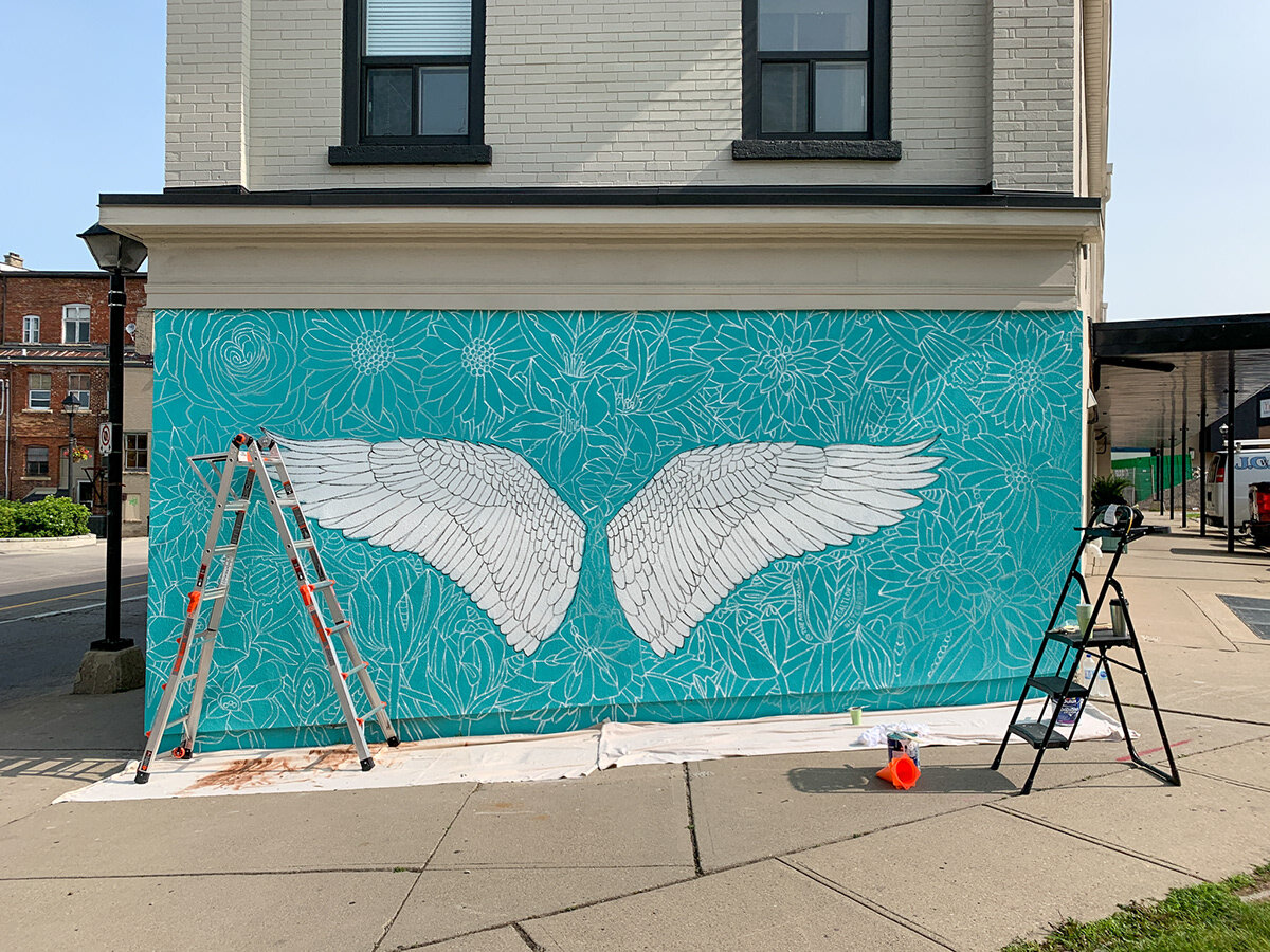
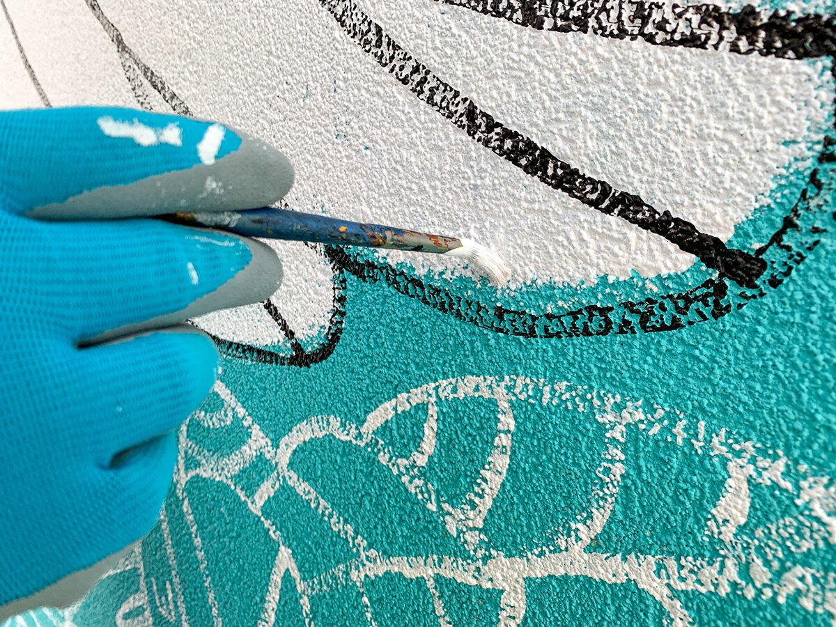
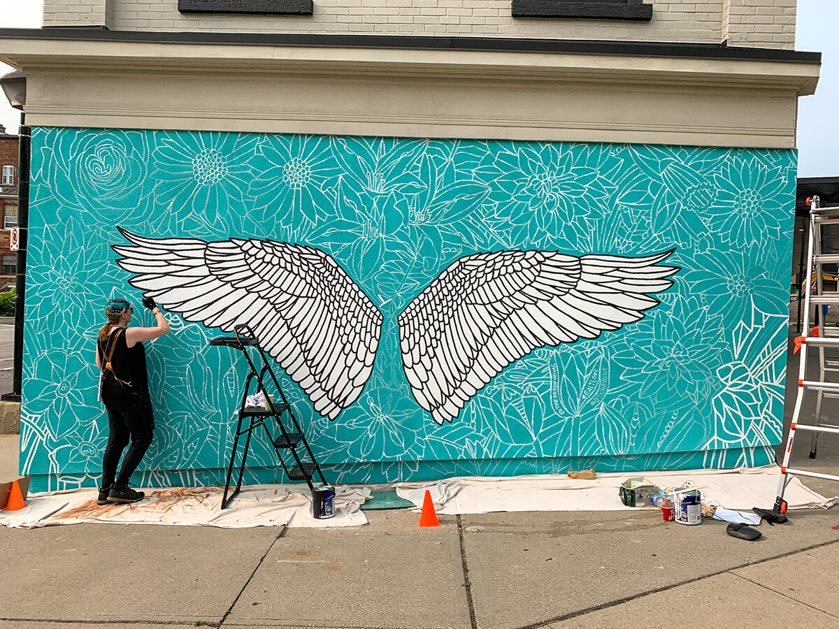
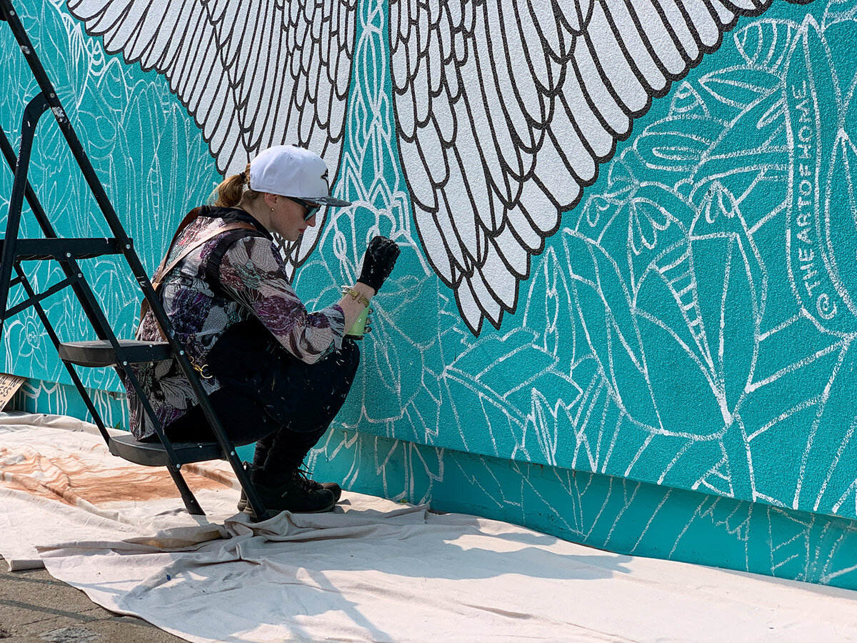
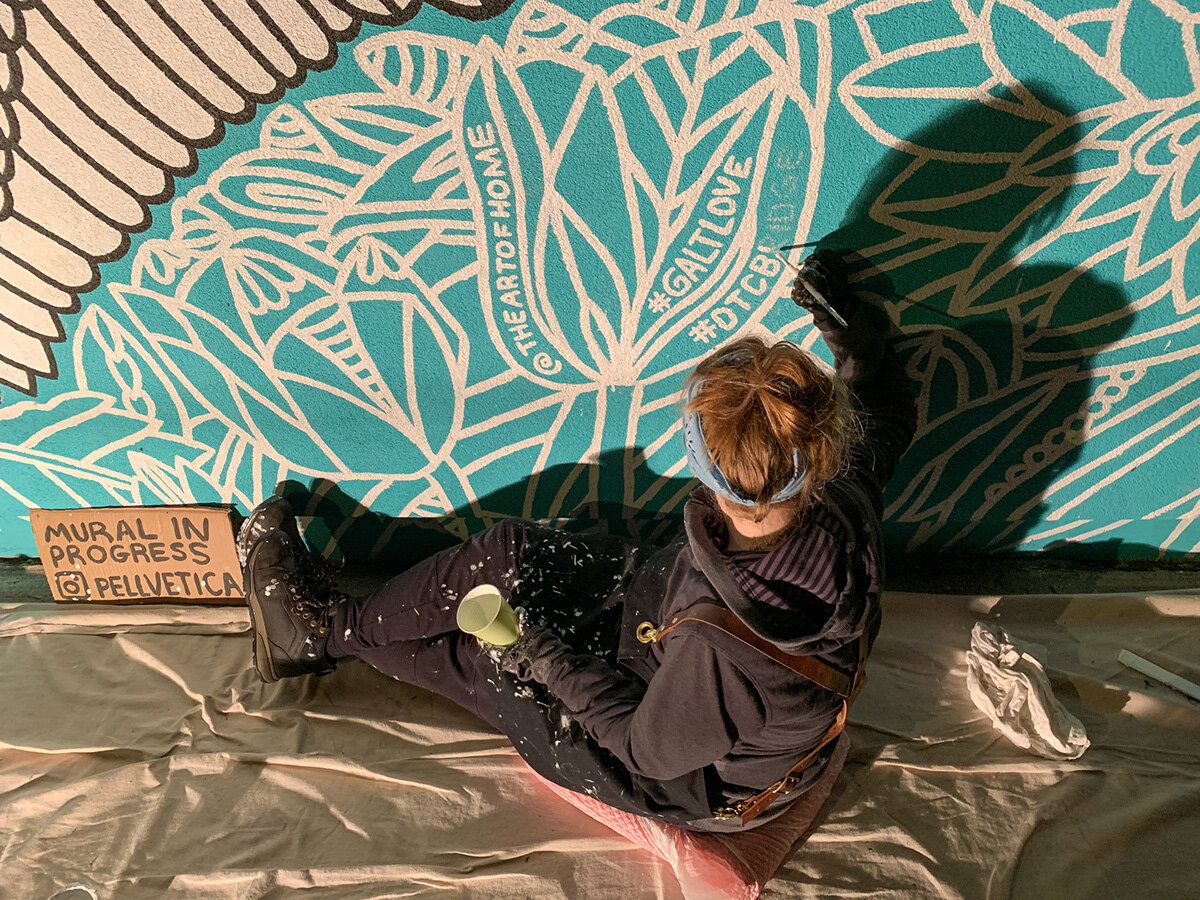
Now the moment has arrived. Stucco.... painting on stucco... painting on stucco with brushes, instead of spray paint... are we crazy? Yes... yes we are! But you simply can't match the crisp, clean edges of a brush with spray paint and we still have a lot to learn so are not yet aware of other techniques on how to apply paint as cleanly. The speed at which we painted on the stucco was and is painfully slow. As you can see in the quick video below, it was a time consuming process, but it was important for us to create the cleanest lines possible, so it was time well spent.
Once you begin painting over a heavily textured surface with a brush, you can't help but ask yourself 'what have I done?'. But that feeling fades after a while, and your sunburn is at maximum capacity, and the flow of the moment begins to kick in. Not only that, the staff at The Art of Home were incredibly accommodating to us, and extremely helpful and encouraging, so we sincerely had a lot of fun during this process. Let the real fun begin!
Here is where things get serious, and our perspective on life shifts a bit... It is impossible to capture in words accurately... The community and people of Galt were so incredibly hospitable, kind, loving, and appreciative. This surprised us and captivated our hearts which has really helped us realize the power that street art can wield. It doesn't matter where you were from, what you look like, or how much money you earn, everyone who visited us while painting had such a deep appreciate for the artwork in their community. We are honoured and amazed at how artwork can bring almost everyone together, especially in a world where division of people seems to be an unwanted political tactic. The community of Galt helps remind us why Canada is such an amazing country. Thank you to everyone who stopped by to chat, shared stories, and made us feel like rock stars. We will never forget what you taught us, and what inspiration you provided us. This is for you!
Completed mural
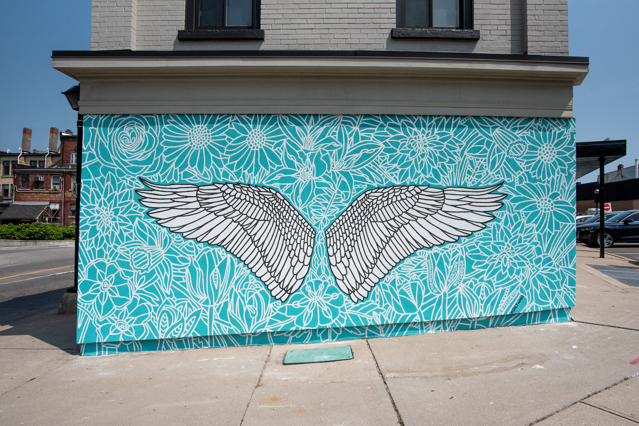
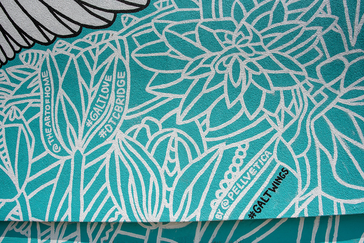
After five 14-18 hour days of production, we complete the mural! We worked late in to the night often (as late as 4am), had amazing conversations, met amazing people, and ultimately had an incredible time creating this piece. It has helped us become hungrier for more opportunities like this, especially if we can interact with the community with which we are painting in. We learned a lot, and were challenged heavily, which is our ultimate aim.
Introducing #GaltWings
You can visit this mural yourself in Cambridge, Ontario! Be sure to hashtag it #galtwings if you do!


