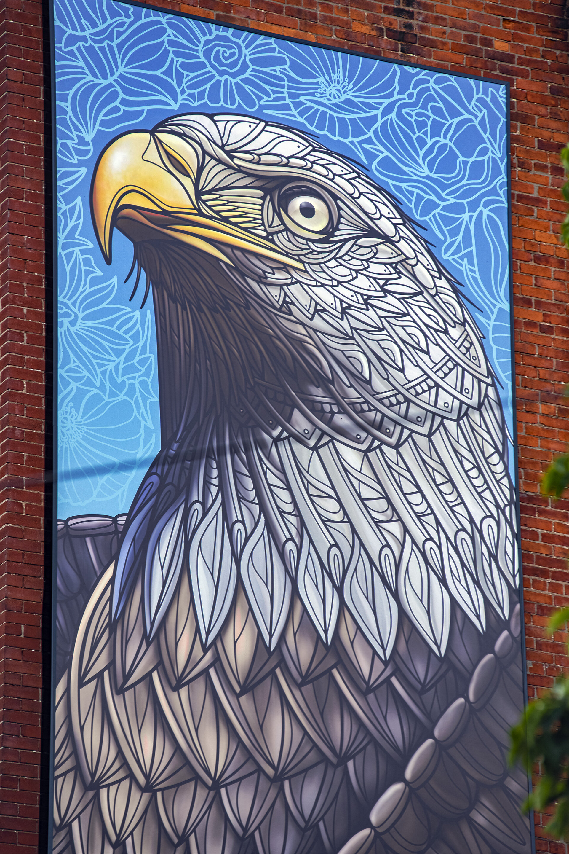
Bald Eagle Mural
A Unique Opportunity
While enjoying our daily morning coffee ritual, we received a message via Instagram from Forge & Foster, a commercial real estate investment firm located in nearby Hamilton, Ontario. They were interested in a very tall illustration for the side of their new investment. Ultimately, they wanted to add more life to the surrounding community, and like us, believe art can accomplish that goal.
Setting the Scene
29 Harriet Street is zoned as a light industrial office property. Forge & Foster's goals were to renovate the existing building structure, enhance the interior and exterior, and bring the space back up to market standards. The team saw tremendous opportunity and potential for this unique space. They want to try to capture the spirit, bringing much-love, confidence, and enthusiasm to this rapidly rejuvenating community. They believe our artwork would add a highly visual, and much-needed splash of colour to the existing industrial space.
The four-story brick and beam building boasts 21,200 square feet and is located in a prime location of Central Hamilton–sitting in the high-growth film district of Barton-Tiffany lands. Hamilton is now the 3rd largest film business cluster in Canada.
Aligning Our Vision
To kick things off, we took our initial call with the Forge & Foster team to learn more about the project and understand their goals. The more we understood this project, the more we thought that it sounded like a really interesting idea.
The best part for us is the proposed subject matter that they were interested in: the mighty North American Bald Eagle. This is such a symbolic and beautiful bird that makes for a rewarding creative challenge–especially at such a massive scale!
Our final artwork would be printed on a huge 10 ft x 32 ft exterior vinyl wrap. Luckily, we had completed a similar large-scale vinyl Great Horned Owl print for the City of Kitchener, so we were familiar with the printing and installation process involved. And since we had already completed several bird-themed works, this project was a natural fit for us. We couldn’t wait to get started!
From Concept to Completion
Work begins by tackling initial design challenges, such as artwork dimensions, placement of objects, what colours to use, etc. The work will be very tall, yet very thin in size: 10 ft x 32 ft (120" w x 384") and contains a 4" bleed border needed for the metal frame that attaches the artwork to the building’s exterior.
With the dimensions in hand, we can now consider ideas for the design itself. We work iteratively, so we always start with simple "5 second napkin-sketches" which helps us express complex ideas. This approach enables all stakeholders to quickly align on a general direction before investing too much time into an idea that may not work.
Although rough at first, we continually improve upon our each time we iterate the design, adding more and more detail until we feel satisfied with sharing our results. We find an iterative approach allows us to work efficiently, and gives our minds the space they need to work out creative challenges.
Once we are satisfied with one or more of our sketches, we present them to the client for feedback. We normally go through three rounds of these revisions.
Preliminary Concepts
Revised Concepts
Final Concepts
With the client’s solid feedback in hand, we iterate the design, spend more time, and add more detail to further realize our vision.
Preliminary Concepts
Here you can see what we were initially thinking for this design. We try a number of ideas, but only present the client with the ones we like best. In this case, as our preliminary concept, we presented a Bald Eagle that is facing the viewer with its mouth wide open.
Revised Concepts
The client offers their initial feedback on the previous design which typically provides us with a new design direction to try. This revised effort is based on things they do or do not like, or ways of better aligning to their brand objectives.
In this case, the client preferred the direction where the Bald Eagle was not looking directly at you, but was looking off into the distance.
Final Concepts
After a few more sketches, and further strengthening of our ideas, we all agree on a final direction which gives us the green light to spend a lot more time on the design, ironing out any wrinkles that bothers us. This is also when we start to add significantly more detail, such as rhythm, pattern, and colour. Everything suddenly comes together like a well-oiled machine.
Time to share our final, polished artwork with the client for approval!
Completed Artwork
Success! The client really likes our concepts. With the client’s approval, city permits in hand, and an installation vendor hired, we prepare the artwork for printing.
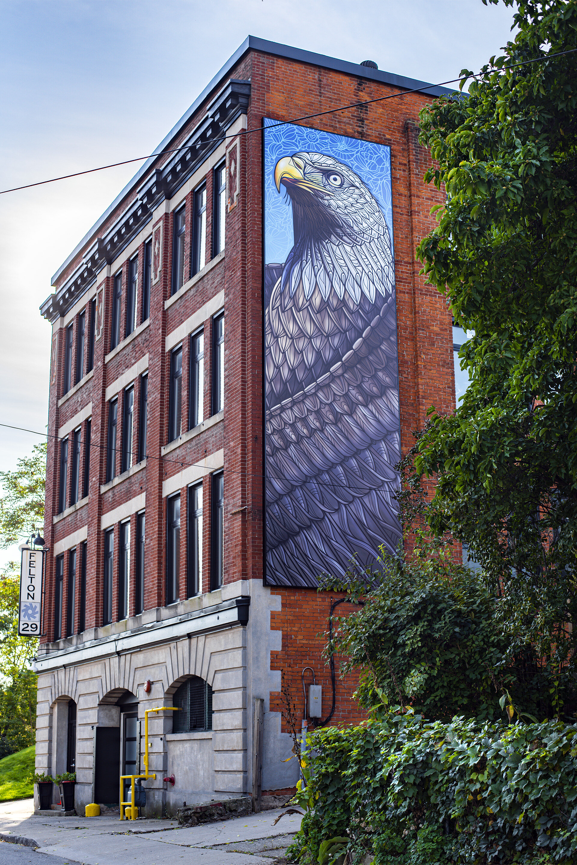
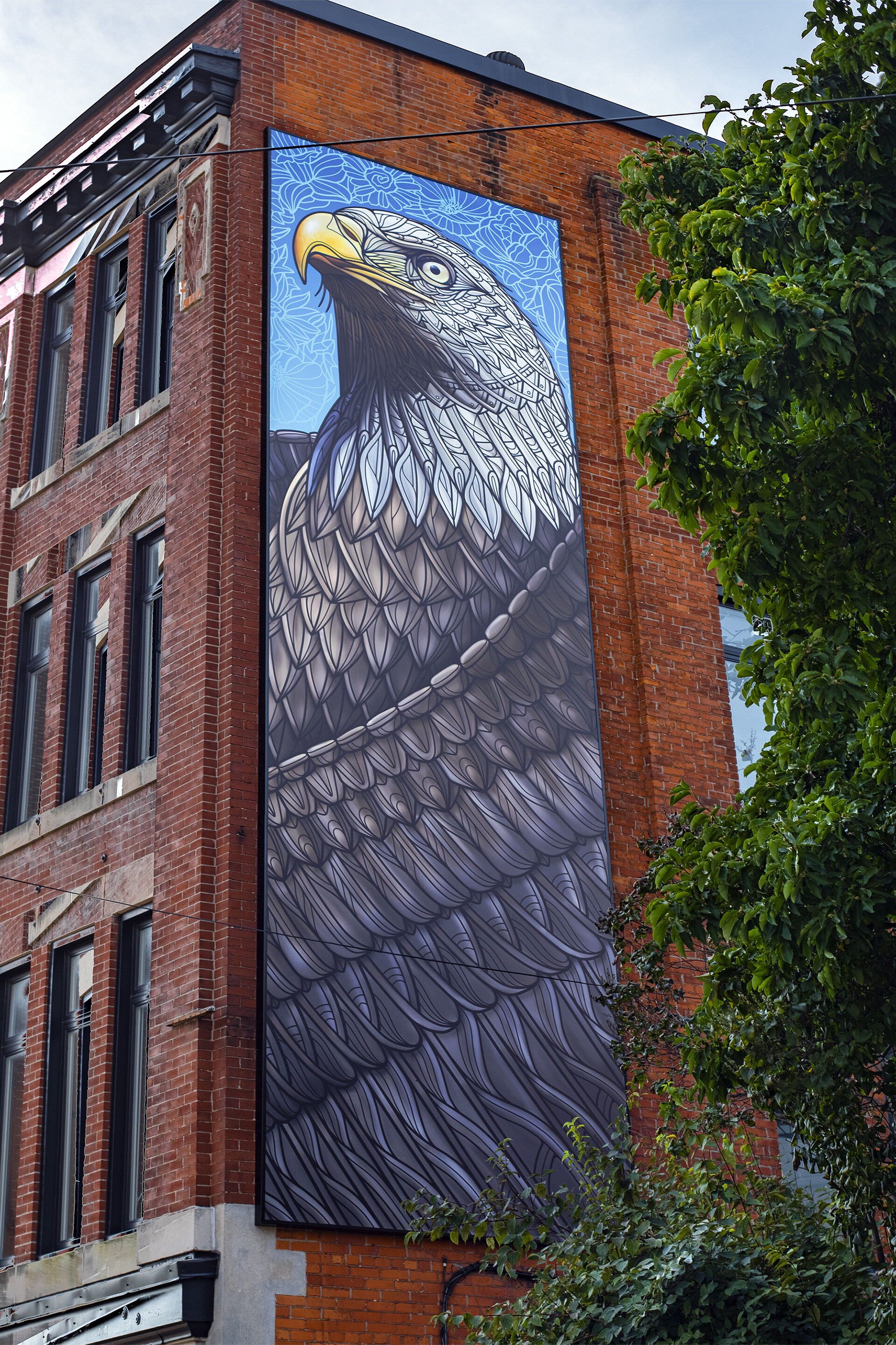
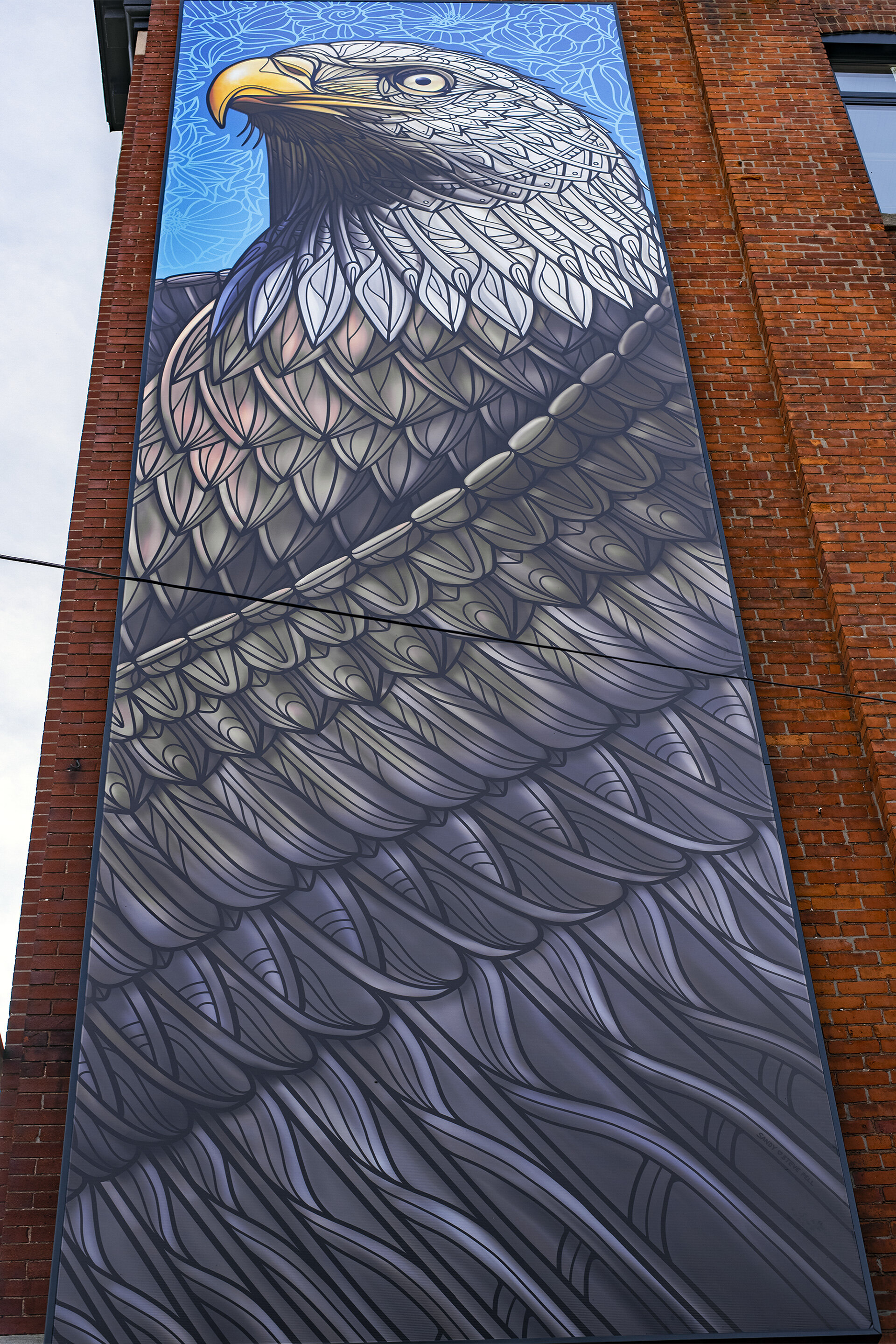
Bald Eagle Mural by Pellvetica
A few weeks after we delivered our final artwork files, we are informed that the job was a success and the artwork is now installed! When we arrived to photograph the work, it was our first time seeing it in the real world. And, needless to say, we were thrilled! Here are the final results of this project. We hope you enjoy!
Thanks for looking!
