Google Particle Accelerator Mural

In early 2019, we were contacted by Google's team in Kitchener. They were planning the final phase of their brand new community space, and needed to hire an artist who could help bring fresh art to the large space while aligning to the existing design aesthetics found throughout the building.
Google is one of the biggest R&D offices in Canada and is already home to Google software engineers, product managers, user experience researchers and designers who collaborate to build systems that are used by hundreds of millions of people around the world.
Inside this space, innovation is constant: whether the team is scaling a system at unheard of GPS, brainstorming under the cyborg moose head in their library, building creative projects during innovation week, or experimenting in the Maker’s Lab, the artwork would need to celebrate that ongoing innovation.
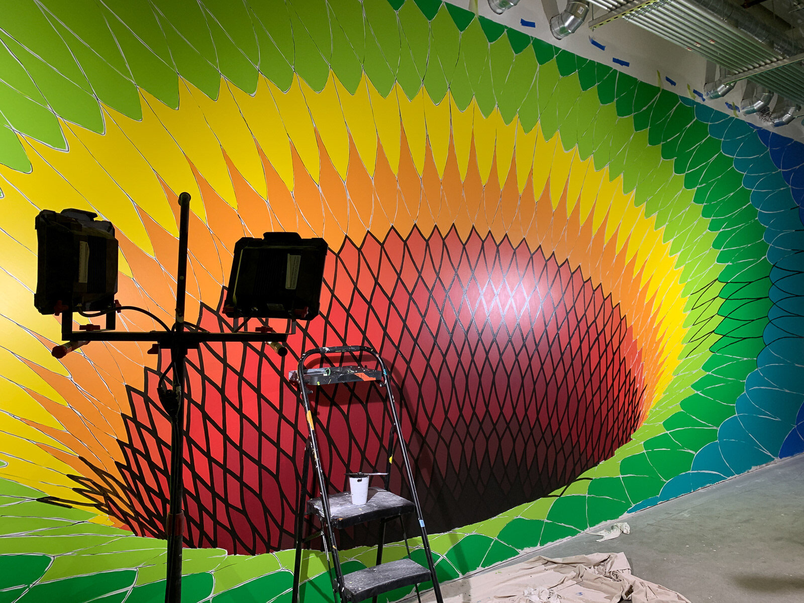
Given the core function of this workspace, we opted to come up with a mural concept that reflected the principles of gravitational waves, mathematics, and basic quantum physics. As a result, the core theme became particle acceleration.
The corridor location where this mural would live was also a perfect opportunity for us to come up with a highly-interactive, viral “selfie” magnet that will become an attractive and memorable icon for Google visitors.


Installation Begins
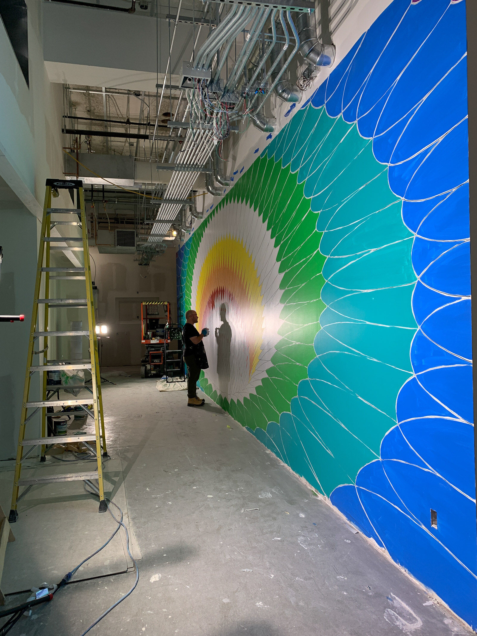
The biggest challenge for us was HOW to install such a large piece, especially while the building was still under construction. We opted to subdivide the space into a grid system, then use a projector to slowly, but meticulously project the mural on to the wall. It took a while, but it allowed us to maintain symmetrical accuracy throughout the entire span of such a large space.


The Colour Story
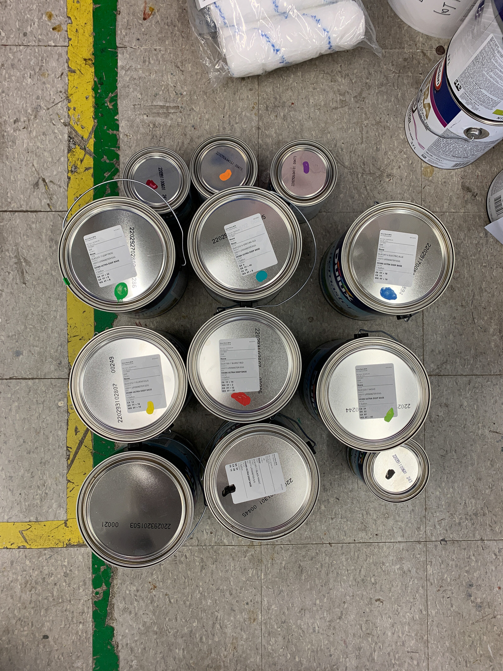
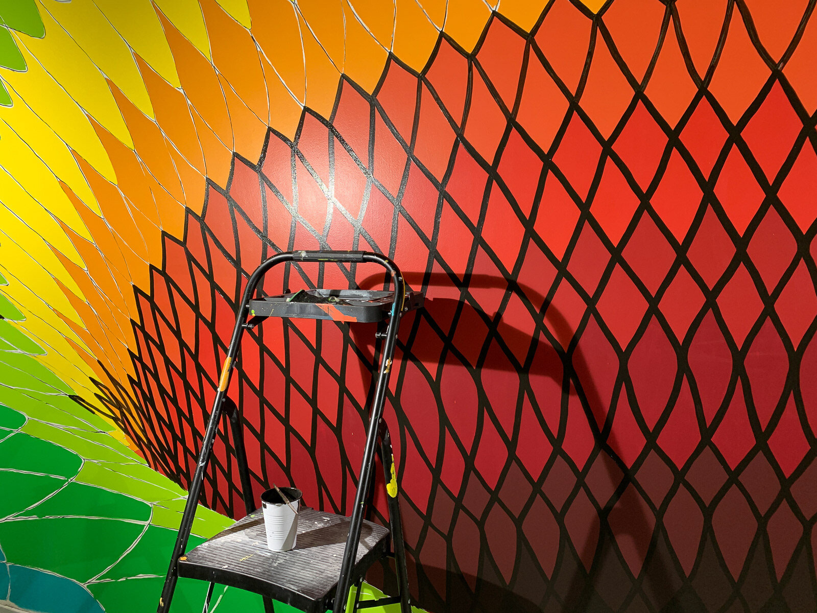
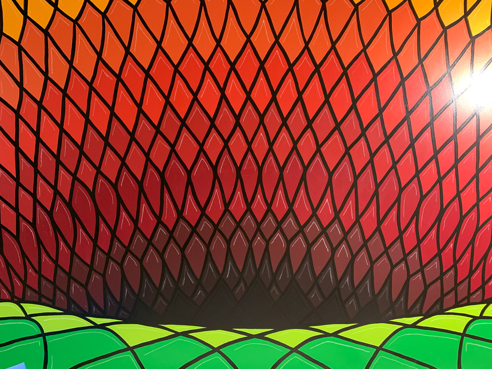
We’ve selected colours from the visible light spectrum, inspired by Google's brand colours. The concept is derived from the idea of astronomical ‘red shift’ when looking at the universe through powerful telescopes. Red-shifted light denotes that an interstellar object is moving away from us. A violet, or blue-shifted object, shows that an interstellar object is moving towards us. We wanted the center of this piece to red-shift because red is the colour commonly used for transformation, energy, and heat.
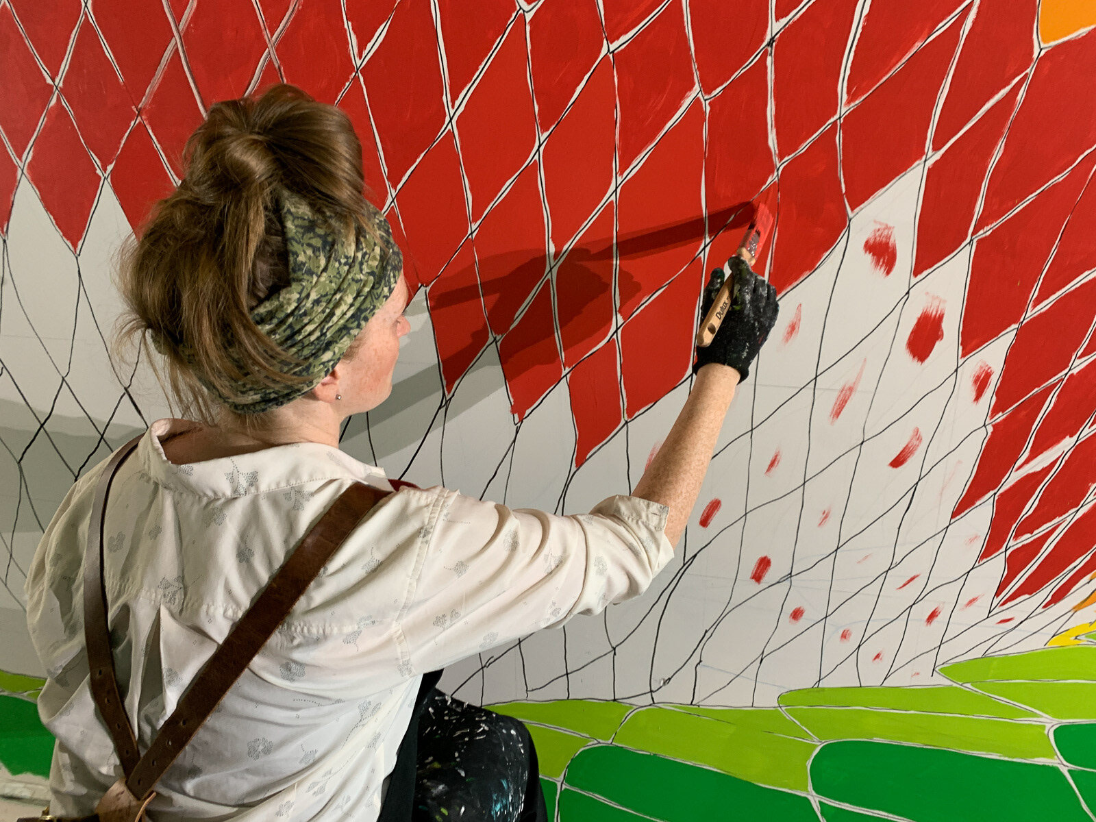
We want the area surrounding the ‘black hole’ to be dense, and aggressive compared to the edges, which will remain loose. Ultra-violet and blue spectrums are often seen as calm, cool, serene, peaceful, and playful. So we want this piece to move from calm blues and violets in the edges to chaotic reds and oranges towards the center. This also creates a tonal gradient of cool to warm colours, providing a sense of depth on this 2D, optical art piece.


Each colour took 2 or more coats of paint to cover completely, but we wanted to be absolutely sure that each colour was as solid as possible. It was a surprisingly time consuming step.
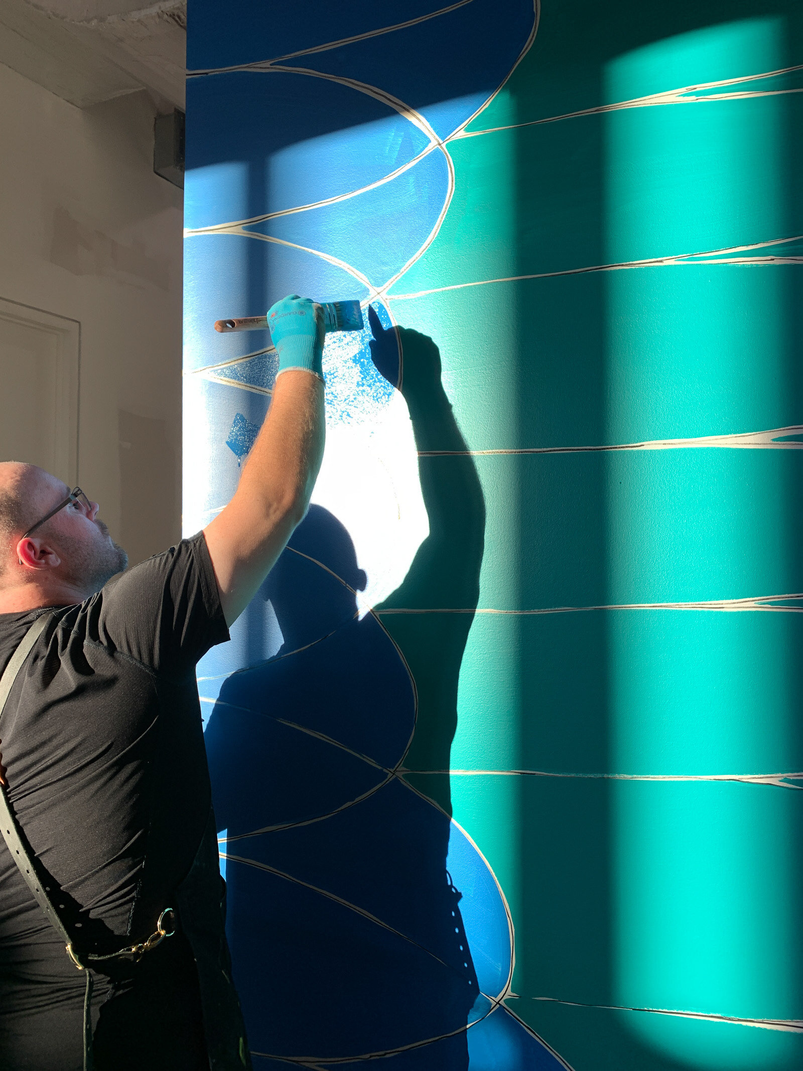
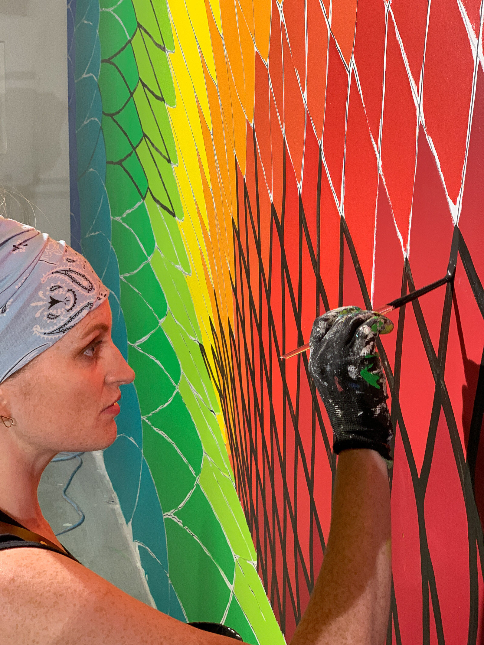
Once the colour was installed, it was time to add the finishing touches, and our favourite step of the whole process. Painting the crisp, black lines connecting the entire piece!
After many, many hours of painting, your legs, arms, and shoulders start to get sore, but you are so close to finishing, so you push through the pain, and continue!